Preview image. Unlock full-res
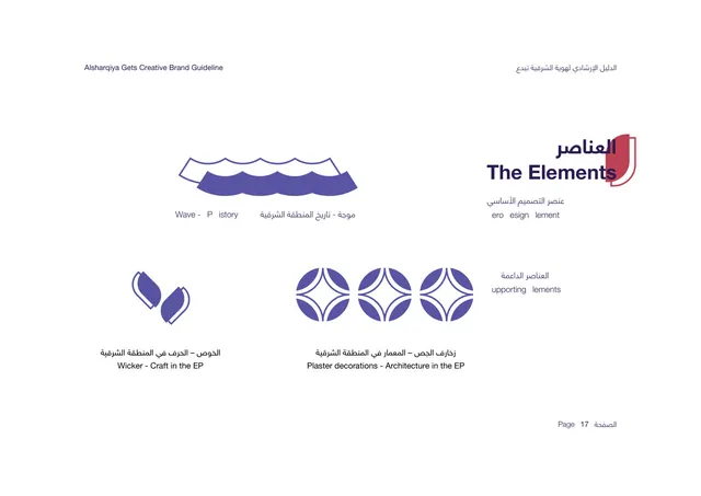
Pattern page showing three vertical pattern panels built from the brand motifs, with a rule against mixing elements.
Summary
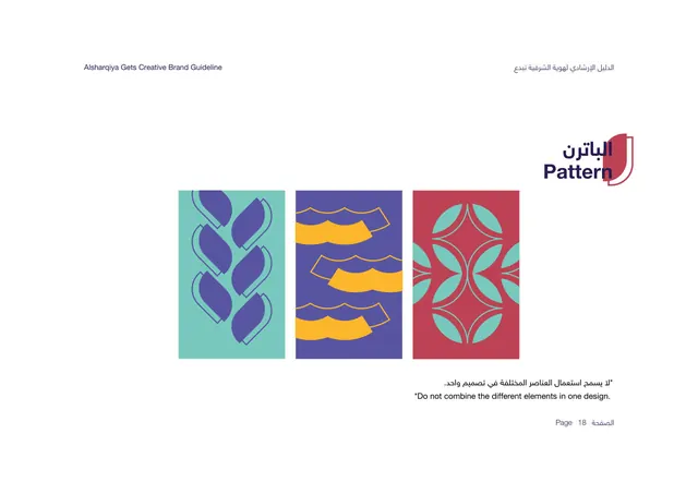
The pattern page: three vertical panels, each a repeat built from one brand motif, with a bilingual note that the elements must not be combined in a single design.
Visual description
White background. The bilingual title "Pattern" sits upper-right in deep purple over the red shield tab. Three tall portrait panels sit side by side: a teal panel with periwinkle wicker-leaf shapes stacked in a column; a periwinkle panel with golden wave shapes repeated in rows; and a brick-red panel with teal plaster-decoration medallions tiled into an interlocking lattice. Each pattern uses just one motif on one brand color. Below, a bilingual caption warns "Do not combine the different elements in one design." "Page 18" bottom-right.
Key takeaway
Building one clean pattern per motif and explicitly forbidding mixing keeps the visual language disciplined. The portrait-panel format reads like ready-made covers or banners, showing the patterns in an applied proportion rather than as flat swatches.
Reuse notes
Reuse the one-motif-per-panel approach to demonstrate a pattern system without it looking busy. The do-not-combine rule is a smart guardrail for any kit with several motifs. The panels double as application mockups for posters, social tiles, or packaging faces.