Preview image. Unlock full-res
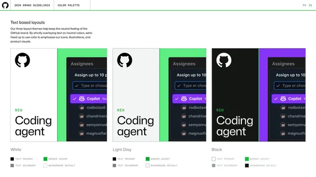
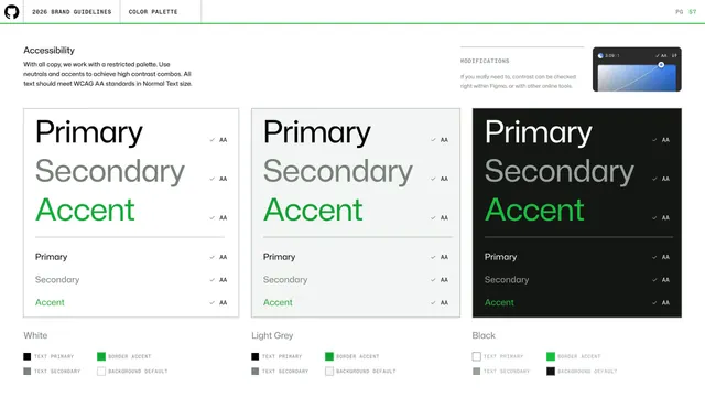
Three text-layout color themes (White, Light Grey, Black) shown as identical "Coding agent" cards, each with a swatch key for text, border accent and background.
Summary
A page demonstrating GitHub's three neutral layout themes by repeating the same "NEW Coding agent" composition on White, Light Grey and Black backgrounds, each with its own color-role key.
Visual description
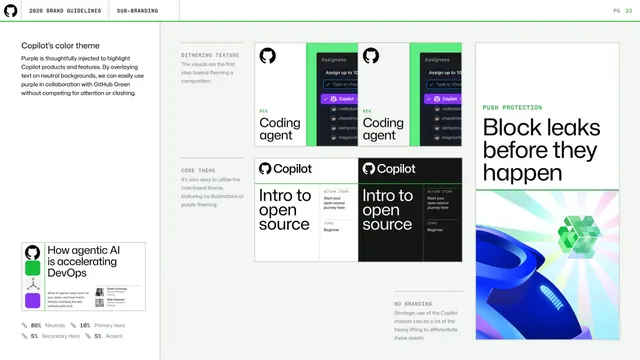
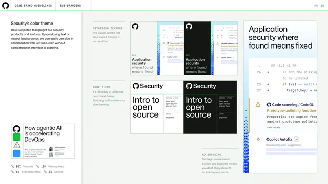
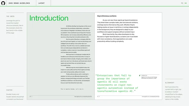
A short left intro explains that strictly overlaying text on neutral colors frees color for icons, illustrations and product visuals. Below sit three identical card mocks side by side: a left text panel ("NEW / Coding agent") and a right product visual (the dark Assignees dropdown with the violet Copilot row) split by a vivid accent stripe (green on White and Light Grey, purple on Black). Under each card is a label (White, Light Grey, Black) and a four-item swatch key: Text Primary, Text Secondary, Border Accent, Background Default. Standard header and green rule above.
Key takeaway
Proving a theming system by holding the layout constant and changing only the background and accent, then printing the role-to-color key beneath each variant so the same recipe reads in three modes.
Reuse notes
Great template for documenting light/dark/neutral theme parity. The repeated-composition-with-key approach makes it obvious that themes are swaps of tokens, not redesigns.
From this deck: GitHub guidelines - text-based layout themes
View deck








More like this





Keep what you find
A free account saves references to boards and can send you a weekly email of picks based on what you save.
To see every result, go Pro.