Preview image. Unlock full-res
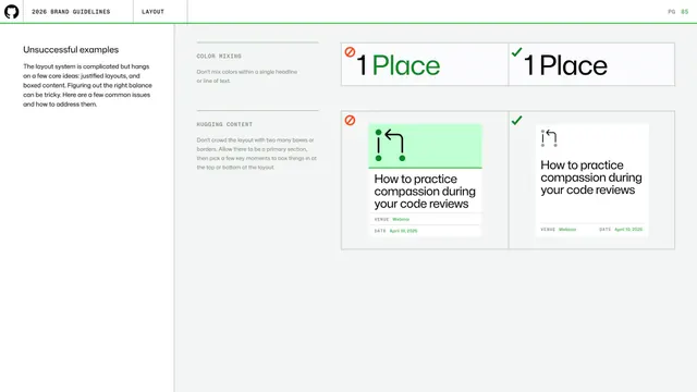
Unsuccessful layout examples page contrasting wrong and right handling of color mixing in headlines and crowding content with boxes, side by side.
Summary
A layout do-and-don't page pairing two common issues (mixing colors within a headline, crowding the layout with too many boxes) each as a red wrong example next to a green correct one.
Visual description
A left intro ("Unsuccessful examples ... justified layouts and boxed content") precedes two stacked rows. The COLOR MIXING row shows a red-flagged "1 Place" with a green-colored word mid-headline beside a green-checked all-black version. The HUGGING CONTENT row shows a red-flagged webinar card whose icon area sits on a green block crowding the text, beside a green-checked version where the icon sits on white with breathing room; both cards read "How to practice compassion during your code reviews" with Venue/Date rows. White background, standard header and green rule above.
Key takeaway
Catching layout-specific errors (color bleeding into a headline word, over-boxing) with the same matched wrong/right pairs and red/green verdict icons used across the deck's other do-and-don't pages.
Reuse notes
Rounds out the layout section with concrete pitfalls. The consistent mistake-page format across type, color and layout makes the whole guideline feel coherent and easy to internalize.
From this deck: GitHub guidelines - layout mistakes
View deck

More like this
Keep what you find
A free account saves references to boards and can send you a weekly email of picks based on what you save.
To see every result, go Pro.