Preview image. Unlock full-res
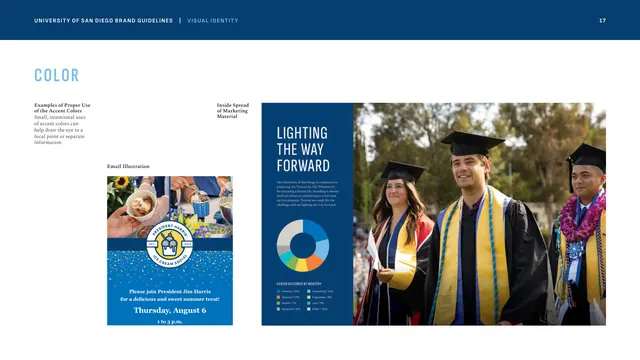
Two applied examples, an email invitation and a marketing spread with a donut chart, showing accent colors used sparingly as focal points.
Summary
A color-usage examples page demonstrating, in two real layouts, how accent colors should appear only as small, intentional focal accents against the blue-and-white base.
Visual description
Header band, then mostly imagery. Small left-column captions ("Examples of Proper Use of the Accent Colors," "Email Illustration") introduce a vertical email invitation for a "President Harris Ice Cream Social": a photo strip of hands holding ice cream over a Torero Blue confetti field with a circular badge and event details in white. To its right, captioned "Inside Spread of Marketing Material," is a two-page spread: a Founders Blue left page with oversized condensed "LIGHTING THE WAY FORWARD" headline and a multicolor donut chart of "Career Outcomes by Industry," beside a full-bleed photo of graduates in caps and gowns with gold and blue stoles. The accent colors appear only inside the chart and confetti.
Key takeaway
Showing the accent rule in action ("small, intentional uses to draw the eye") is more convincing than stating it. The donut chart is the sanctioned home for the bright palette, while the surrounding layout stays disciplined blue-on-white. The oversized condensed headline over a blue field is the brand's signature editorial move.
Reuse notes
A good reference for proving palette discipline through applied examples rather than swatches. Use when a guideline needs to model restraint and show accents confined to data and decorative flourishes. Pairs with the accent-palette and stats pages.
From this deck: Examples of proper accent-color use
View deck


More like this









Keep what you find
A free account saves references to boards and can send you a weekly email of picks based on what you save.
To see every result, go Pro.