Preview image. Unlock full-res
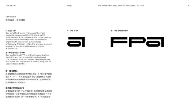
Logo-versions page presenting the two marks, the standalone a icon and the FPA wordmark, with usage notes in two languages.
Summary
The two official logo versions: the simplified "a" icon (the A of ART) and the full FPA wordmark, each shown in black with explanatory notes on when to use them.
Visual description
White page, three columns. The left column carries two stacked descriptions: "1 - Icon 'A'" and "2 - Wordmark 'FPA'", each in bold English with a Chinese translation below, explaining the icon as the core unit and the wordmark for full-name use (and noting the three letters must stay fixed). The middle column shows "1 - The Icon", the standalone black "a" mark; the right column shows "2 - The Wordmark", the full FPA logotype. Both specimens are solid black on white at large scale.
Key takeaway
Presenting the icon and the wordmark on one spread, each with its own usage rule, clearly separates the two assets. Labeling the icon as derived from "the A of ART" reinforces the brand story.
Reuse notes
A clean two-version logo page. State plainly which mark is primary and any locking rules (here: letters fixed, no isolating F or P). Reuse when a brand ships both a monogram and a full wordmark.
From this deck: Logo versions, icon and wordmark
View deck









More like this






Keep what you find
A free account saves references to boards and can send you a weekly email of picks based on what you save.
To see every result, go Pro.