Preview image. Unlock full-res
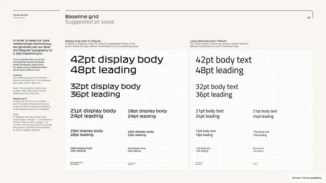
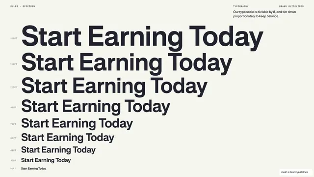
A dense type-scale page lists display and long-read point sizes with matched leading down a descending ladder of sample lines.
Summary
A baseline-grid and suggested-sizes page: two columns of descending sample lines (display body in F1, long-read in Titillium) each labeled with its point size and matched leading, derived from a 12pt baseline.
Visual description
Off-white page, standard running header with "Visual Identity / Typography" top left, title "Baseline grid / Suggested pt sizes" center-left, page 90 top right, under a hairline rule. A dense left column of body copy explains keeping type harmonious on a 12pt baseline grid and how leading divides by three. The right two-thirds is split into two large bordered panels: the left panel "Display body text: F1 Regular" and the right "Long-read body text: Titillium". Each panel shows a ladder of sample lines stepping down from large to small (42pt/48pt leading, 32pt/36pt, 21pt/24pt, 18pt, 15pt/18pt, 12pt/15pt, and smaller), every line self-labeling its size and leading. The lines shrink toward the bottom of each panel.
Key takeaway
A self-documenting size ladder where each specimen line literally states its own point size and leading, so the type scale is legible at a glance and tied back to a single baseline unit. Splitting display and long-read into parallel panels lets a designer compare the two systems side by side.
Reuse notes
The canonical "type scale / baseline grid" reference page. The trick is making each line label itself, and anchoring the whole ladder to one baseline increment. Dense but skimmable; works in print-style guidelines.
From this deck: Baseline grid, suggested point sizes
View deck
































More like this
Keep what you find
A free account saves references to boards and can send you a weekly email of picks based on what you save.
To see every result, go Pro.