Preview image. Unlock full-res
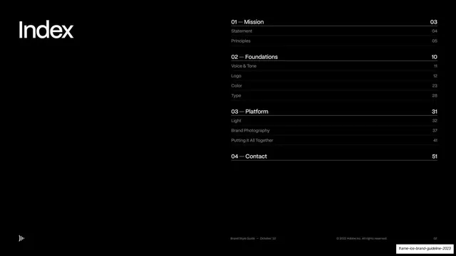
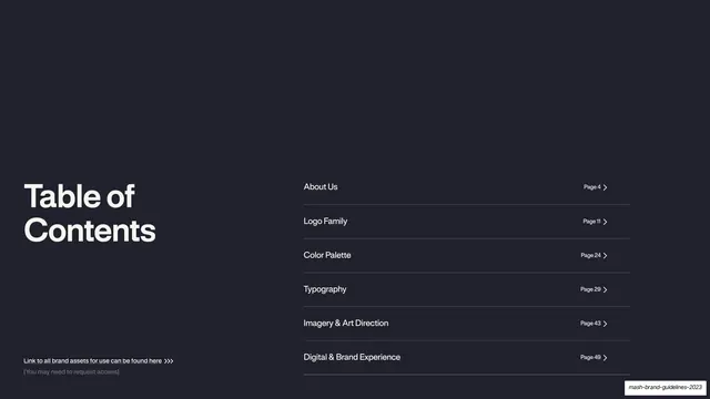
Dark navy table of contents with the title set large at lower-left and six right-aligned section entries with page numbers and chevrons on hairline rules.
Summary
The contents page: a dark navy field with "Table of Contents" set large at lower-left and six section titles stacked on the right, each with a page number and chevron.
Visual description
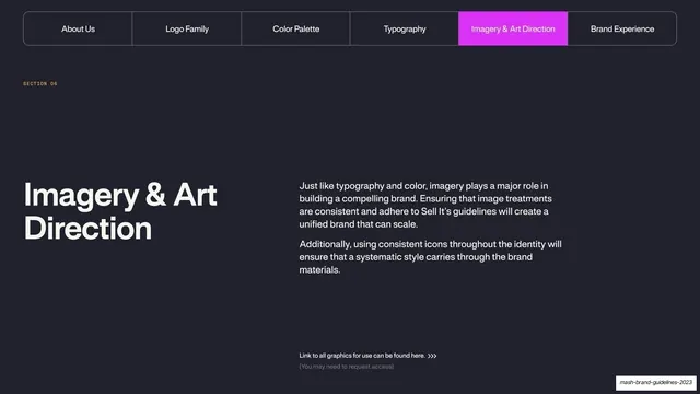
Near-black navy background. "Table of Contents" is set in large light bold sans at the lower-left, wrapping to two lines. The right half holds a vertical list of six section entries in light sans (About Us, Logo Family, Color Palette, Typography, Imagery & Art Direction, Digital & Brand Experience), each followed at the far right by a small "Page NN" label and a chevron, separated by thin hairline rules. A tiny monospace footnote sits at the bottom-left: "Link to all brand assets for use can be found here" with a "(You may need to request access)" subline.
Key takeaway
Anchoring the section list to the right and letting the page title sit large and low-left, so the contents read like a menu rather than a centered index. Hairline rules plus right-aligned page numbers give it an editorial, almost tabular feel.
Reuse notes
A clean contents pattern for any long deck or guidelines document. The chevrons imply navigability (good if the deck is interactive or hyperlinked). The asset-link footnote is a smart place to point readers to the live file.
From this deck: Table of contents
View deck