
Preview image. Unlock full-res
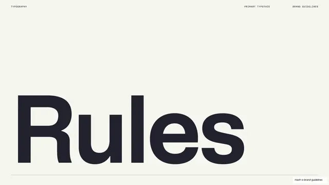
Light slide naming the primary typeface with the single oversized word "Rules" set huge and anchored above a hairline rule.
Summary
A primary-typeface title page on warm cream: the single word "Rules" set enormously in charcoal across the lower half, above a thin full-width rule, identifying the brand's main typeface.
Visual description
Warm cream (#F4F1E8) full bleed, with monospace labels "TYPOGRAPHY" left and "PRIMARY TYPEFACE" / "BRAND GUIDELINES" right. The lower-left two-thirds is filled by the word "Rules" in a heavy neo-grotesque, set massive in near-charcoal so its letterforms read as a specimen in their own right. A thin hairline rule runs the full width just below the word, separating it from the footer line.
Key takeaway
Introducing a typeface by setting its name (here literally "Rules") at poster scale so the specimen and the section title are the same object, with only a hairline rule and tiny utility labels for context.
Reuse notes
A confident opener for a primary-typeface section; works whenever the typeface name can double as a display word. Depends on a characterful type design to carry the page. Follow with weight, scale and specimen pages.
From this deck: Mash Rules primary typeface title page
View deck
















































More like this







Keep what you find
A free account saves references to boards and can send you a weekly email of picks based on what you save.
To see every result, go Pro.