Preview image. Unlock full-res
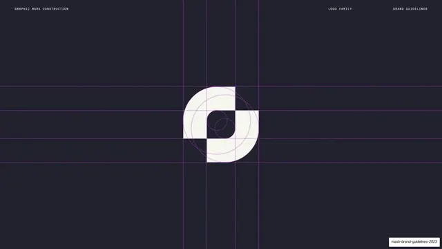
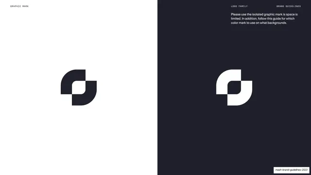
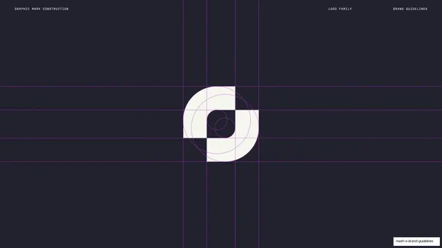
Dark navy page showing the Mash graphic mark in white centered over a purple dotted construction grid of circles and crosshair guides.
Summary
A logo-construction page: the Mash graphic mark rendered in white at center over a magenta dotted grid of circles and crosshairs that reveals its geometry.
Visual description
Near-black navy background. The graphic mark sits centered, rendered in solid off-white: an abstract form of two interlocking rounded-square shapes. Behind and through it runs a construction system in fine magenta dotted lines: concentric circles, vertical and horizontal crosshair guides, and column rules spanning the full frame, showing how the mark is built from circular and square geometry. A thin monospace running header reads "GRAPHIC MARK CONSTRUCTION" left and "LOGO FAMILY" / "BRAND GUIDELINES" right.
Key takeaway
Putting the logo on its construction grid in the brand's accent color against a dark field, so the geometry reads clearly and looks intentional. The magenta guides double as a brand cue while doing their technical job.
Reuse notes
Standard logo-mechanics content for any identity system, but the dark background plus magenta guides make it feel designed rather than diagrammatic. Use alongside the clearspace and dark/light usage pages to complete the mark documentation.
From this deck: Graphic mark construction
View deck











































More like this







Keep what you find
A free account saves references to boards and can send you a weekly email of picks based on what you save.
To see every result, go Pro.