Preview image. Unlock full-res
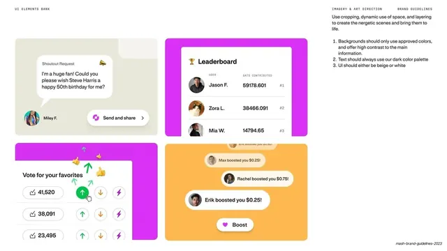
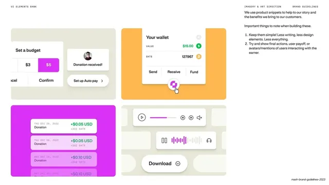
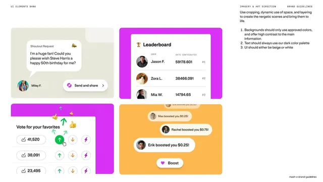
Light UI bank showing shoutout, leaderboard, voting and boost product snippets on beige, magenta and orange cards beside cropping and contrast rules.
Summary
A second UI-elements bank page showing four engagement snippets (shoutout request, leaderboard, upvote/boost voting, boost notifications) on colored cards, with rules on cropping, contrast and color use.
Visual description
White full bleed. A tiny tracked mono header reads "UI ELEMENTS BANK" left, "IMAGERY & ART DIRECTION" center-right, "BRAND GUIDELINES" right. A two-by-two of large rounded cards: a beige card with a "Shoutout Request" chat bubble and a magenta "Send and share" button, a magenta card holding a white "Leaderboard" table ranking users by sats contributed, a magenta card with a "Vote for your favorites" UI of upvote arrows and lightning icons, and an orange card stacking "Erik boosted you $0.25!" style notification pills above a "Boost" button. The right column lists short numbered rules: use approved colors with high contrast, text in the dark palette, UI on beige or white. The deck slug sits tiny at bottom-right.
Key takeaway
Extending the snippet-bank system to social and gamification UI while reinforcing the same constraints (approved colors, dark text, beige or white surfaces), so engagement features stay visually on-brand. The mix of beige, magenta and orange card backings shows the palette working across snippet types.
Reuse notes
Pairs with the prior UI-bank page as a two-part library of product moments; good for fintech, creator or community apps presenting interactive features. The card-color rules are reusable as a constraint list. Keep the embedded UI simplified so the cards stay legible at slide scale.
From this deck: UI elements bank with leaderboard and boosts
View deck





More like this


Keep what you find
A free account saves references to boards and can send you a weekly email of picks based on what you save.
To see every result, go Pro.