Preview image. Unlock full-res
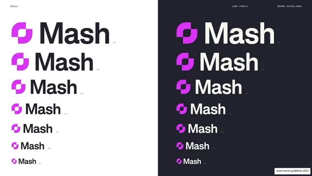
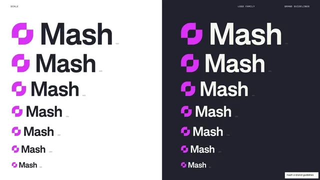
Split light/dark slide stepping the Mash logo down through seven pixel sizes to set minimum legible scale on each background.
Summary
A minimum-scale page split into a cream left half and a charcoal right half, each stacking the Mash logo at seven decreasing pixel sizes (600 down to 150) to show how small it can go.
Visual description
Vertically split: warm cream on the left, near-charcoal on the right. Header reads "SCALE" left and "LOGO FAMILY" / "BRAND GUIDELINES" right. Each half stacks seven instances of the magenta-mark-plus-"Mash"-wordmark lockup, left-aligned and getting progressively smaller top to bottom, each tagged with a tiny pixel value (600, 500, 400, 300, 250, 200, 150). The left uses a charcoal wordmark on cream; the right mirrors it with a cream wordmark on charcoal, so the smallest legible size is verified on both backgrounds.
Key takeaway
Testing minimum size as a descending ladder labeled in pixels, mirrored on light and dark in one split frame, so the legibility floor is proven for both surfaces at a glance.
Reuse notes
A strong pattern for the minimum-size page of a brand book, especially for marks that must survive on both light and dark UI. Set the pixel steps to your real export targets (favicon, app icon, nav).
From this deck: Mash logo minimum scale, light and dark
View deck

































More like this








Keep what you find
A free account saves references to boards and can send you a weekly email of picks based on what you save.
To see every result, go Pro.