Preview image. Unlock full-res
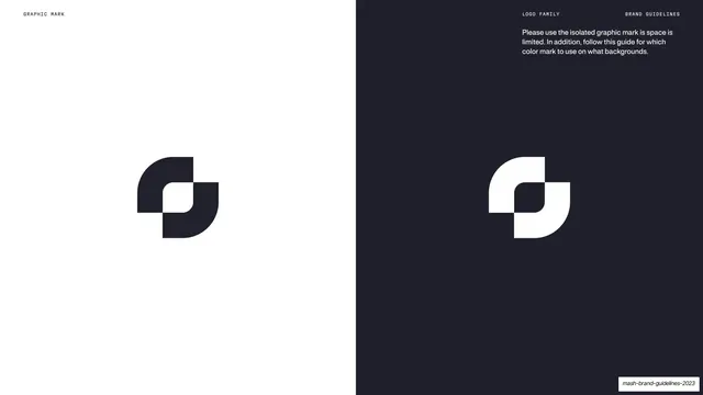
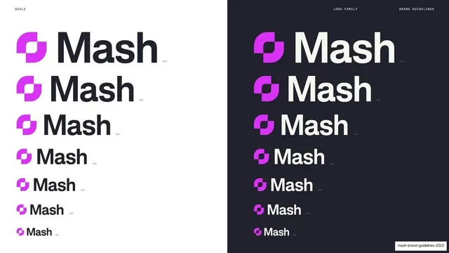
Page split into a white half and a navy half, each showing the Mash graphic mark in the opposite tone, with a short usage note on the dark side.
Summary
A mark-usage page split vertically into a white half and a navy half, each carrying the graphic mark in the contrasting color to show light- and dark-background treatment.
Visual description
The page is split down the middle: the left half is white, the right half near-black navy. On the white side, the graphic mark sits centered in dark navy; on the navy side, the same mark sits centered in white. Above the mark on the dark half, a short light sans note reads "Please use the isolated graphic mark is space is limited. In addition, follow this guide for which color mark to use on what backgrounds." Tiny monospace labels run along the top: "GRAPHIC MARK" left, "LOGO FAMILY" / "BRAND GUIDELINES" right.
Key takeaway
The vertical split that demonstrates both color treatments in a single frame, so the contrast rule is self-evident: dark mark on light, light mark on dark. No extra explanation needed beyond the one note.
Reuse notes
An efficient way to document positive/negative logo usage on one page instead of two. Reusable for any mark or wordmark. The split also previews the deck's larger cream-versus-navy duality applied to the logo itself.
From this deck: Graphic mark on light and dark
View deck









































More like this








Keep what you find
A free account saves references to boards and can send you a weekly email of picks based on what you save.
To see every result, go Pro.