Preview image. Unlock full-res
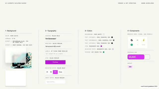
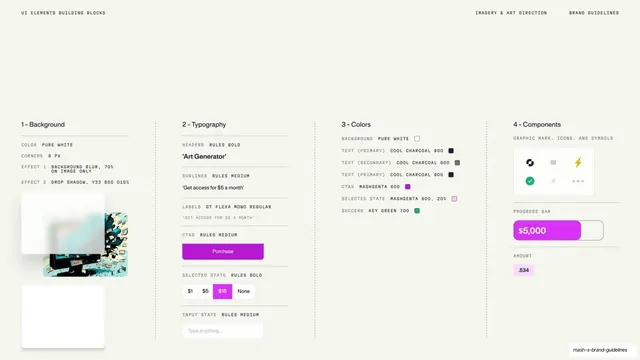
Light four-column spec breaking a UI snippet into Background, Typography, Colors and Components rules, with annotated values and small live examples.
Summary
A light technical spec dissecting a UI snippet into four labeled columns (Background, Typography, Colors, Components), each listing the exact rules and showing small live samples.
Visual description
Warm off-white full bleed. A tiny tracked mono header reads "UI ELEMENTS BUILDING BLOCKS" left, "IMAGERY & ART DIRECTION" center-right, "BRAND GUIDELINES" right. The lower two-thirds is four columns separated by dashed vertical dividers: "1 - Background" lists pure white, 8px corners, blur and drop-shadow effects with two sample card mockups; "2 - Typography" shows headers, sublines, labels and CTA styles with a magenta "Purchase" button and a $1/$5/$15/None selector; "3 - Colors" lists named swatches (Cool Charcoal 800/600, Mashgenta 600, Key Green 700) with chips; "4 - Components" shows a graphic-mark and icon set plus a magenta progress bar at "$5,000" and an amount chip. The deck slug sits tiny at bottom-right.
Key takeaway
Reverse-engineering one finished UI snippet into a four-column anatomy (surface, type, color, parts) so the recipe behind the product look is fully documented. Dashed column dividers keep four dense spec lists readable side by side.
Reuse notes
An advanced documentation page for design-system-minded guidelines that want to specify how UI is built, not just how it looks. Best after the snippet-bank pages as the technical backing. Dense by nature, so reserve it for audiences who need the implementation detail.
From this deck: UI building blocks spec in four columns
View deck






























More like this

Keep what you find
A free account saves references to boards and can send you a weekly email of picks based on what you save.
To see every result, go Pro.