Preview image. Unlock full-res
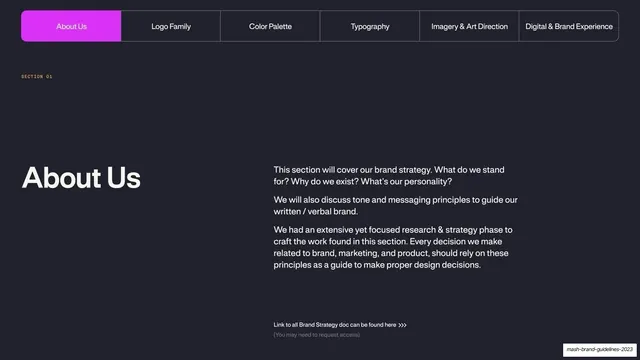
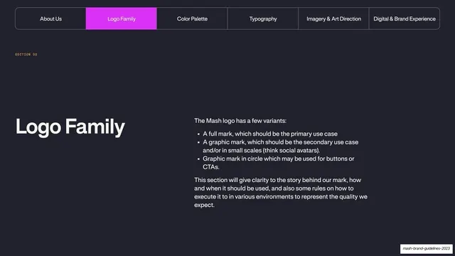
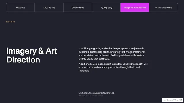
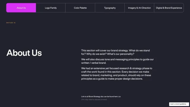
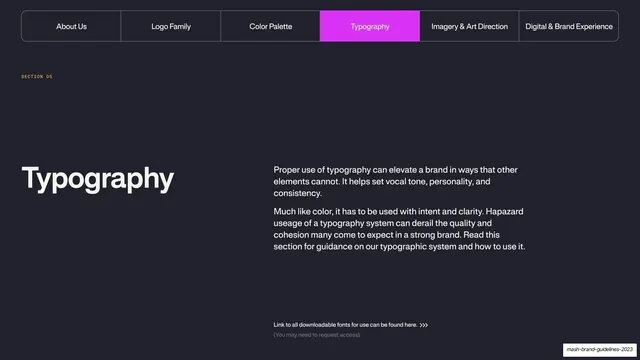
Dark section-divider slide with the sticky tab nav highlighting Typography, an oversized title and a two-paragraph intro plus a downloadable-fonts link.
Summary
The Typography section opener: near-black slide with the running tab nav highlighting "Typography" in magenta, an oversized title lower-left, a two-paragraph intro to the right, and a small link to downloadable fonts.
Visual description
Near-black (#1E1E2A) full bleed. The same six-item segmented tab bar runs across the top, now with the "Typography" tab filled bright magenta and the others outlined. A magenta "SECTION 05" eyebrow sits mid-left. Lower-left, the oversized cream title "Typography" in the heavy grotesque. To its right, two short paragraphs argue that good type sets tone, personality and consistency and must be used with intent. Near the bottom, a small muted line "Link to all downloadable fonts for use can be found here" with a chevron, and a parenthetical note that access may be required.
Key takeaway
Reusing the exact section-divider system from earlier (fixed tab bar, magenta active tab, oversized title, two-line intro) for consistency, and tucking a practical "download the fonts here" link at the foot so the page is also a resource handoff.
Reuse notes
Keep section dividers identical across a long deck and only change the active tab and title; it makes the deck feel systematic. Adding the font-access link turns the divider into a useful jumping-off point for implementers.
From this deck: Mash Typography section divider
View deck