Preview image. Unlock full-res
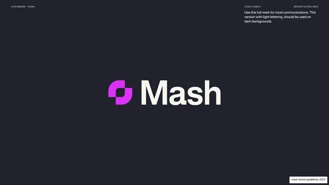
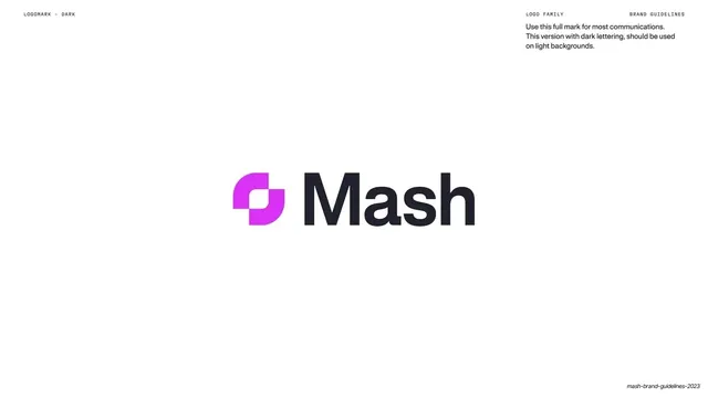
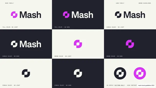
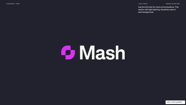
Dark navy page with the full Mash lockup centered, the magenta gradient mark beside the cream wordmark, and a usage note about light lettering on dark backgrounds.
Summary
The dark counterpart to the previous page: the Mash logomark and cream wordmark centered on navy, with a note that the light-lettering version belongs on dark backgrounds.
Visual description
Near-black navy background. The full Mash lockup sits centered: the violet-to-magenta gradient graphic mark to the left of a large cream "Mash" wordmark in a bold geometric sans. A short usage note in light sans sits under the right header: "Use this full mark for most communications. This version with light lettering, should be used on dark backgrounds." Tiny monospace labels run across the top: "LOGOMARK - DARK" left, "LOGO FAMILY" / "BRAND GUIDELINES" right.
Key takeaway
Pairing the light-on-dark lockup at the identical scale and position to the dark-on-light page, so the two usage pages read as a matched set. The gradient mark stays constant across both; only the wordmark color flips.
Reuse notes
The canonical "primary logo on dark" page, the mirror of the previous slide. Keeping the mark's gradient identical on both backgrounds while only swapping the wordmark color is the right rule to document. Together they cover the deck's full cream/navy duality.
From this deck: Full logomark on dark
View deck



































More like this








Keep what you find
A free account saves references to boards and can send you a weekly email of picks based on what you save.
To see every result, go Pro.