Preview image. Unlock full-res
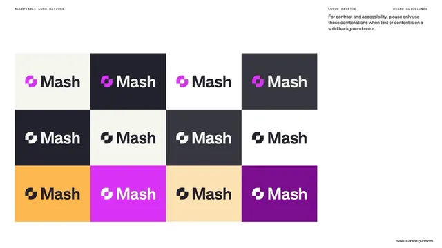
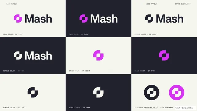
A 3x4 grid showing the Mash lockup on each approved brand-color background to confirm contrast in context.
Summary
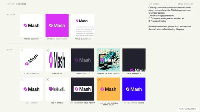
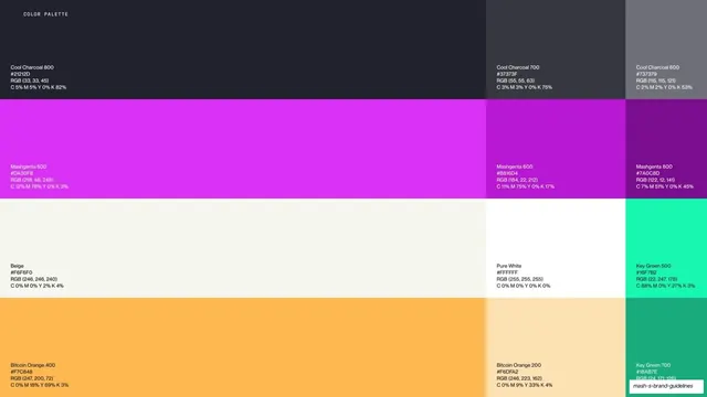
A logo-on-color grid: the "Mash" lockup repeated across twelve tiles in different approved brand-color backgrounds to show which mark color works on which ground.
Visual description
Warm off-white ground with a 4-column, 3-row grid of color tiles, each carrying the "Mash" lockup. Top row: cream, near-black, white, and dark-grey tiles with dark or cream marks. Middle row: black, cream, charcoal, and white tiles. Bottom row: amber, magenta, pale-amber, and purple tiles, each with the correctly contrasting mark color. The grid demonstrates mark color selection against every approved background. A right-aligned note repeats the contrast/accessibility guidance. Header: "ACCEPTABLE COMBINATIONS" / "COLOR PALETTE" / "BRAND GUIDELINES".
Key takeaway
Validating the actual lockup, not an abstract swatch, on every approved background in one grid, so the reader sees the real mark-on-color outcome rather than inferring it. It turns the contrast rule into a gallery of finished, approved placements.
Reuse notes
A reassuring page for stakeholders who place the logo on colored panels. Pairs naturally after the swatch and combination pages; show the mark at a realistic size and keep the correct color choice consistent across tiles.
From this deck: Mash logo lockups on brand backgrounds
View deck

































More like this







Keep what you find
A free account saves references to boards and can send you a weekly email of picks based on what you save.
To see every result, go Pro.