
Preview image. Unlock full-res
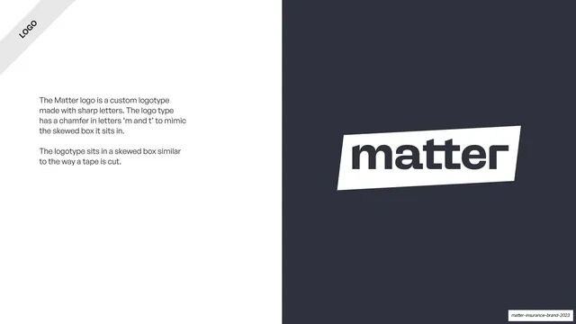
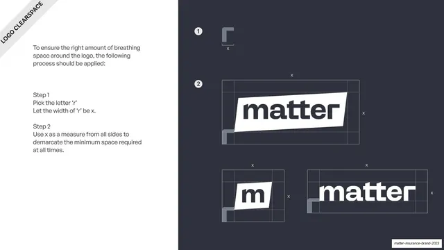
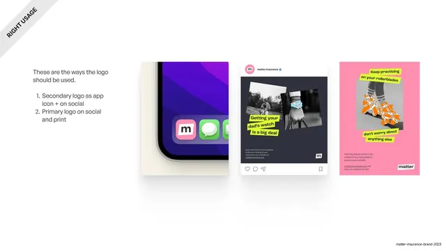
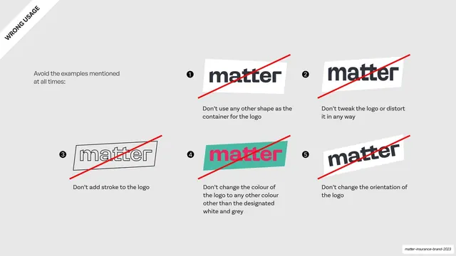
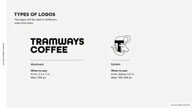
Three-column page showing primary, secondary and type logo variants each with a "when to use" note.
Summary
A three-column logo-variant page: primary lockup, secondary "m" mark, and a plain type logo, each above a hairline rule and a "when to use" caption.
Visual description
A white full-bleed slide with a rotated "TYPES OF LOGO" ribbon in the top-left corner and a short intro line. Below, three evenly spaced columns. Left: the primary logo, the white "matter" tape lockup reversed out of a solid near-black square, labelled "Primary logo" with a "When to use" note (most places, website, print). Center: the secondary logo, a lowercase "m" in a small white skewed box on a black square, labelled "Secondary logo" (size restrictions, social, favicon). Right: the type logo, just the dark "matter" wordmark with no box, labelled "Type logo" (official matters, on white). Each variant sits above a thin hairline rule with bold sub-labels and regular body copy.
Key takeaway
Showing each logo variant at its actual usage size on its correct background, then pairing every one with a one-line "when to use" rule, so the page teaches application, not just appearance. The hairline rule under each lockup cleanly separates art from instruction.
Reuse notes
A model three-up template for the logo-variants page of any identity system. Directly reusable: swap the three lockups and the usage notes. The black containers here are because the marks are reversed; adjust backgrounds to suit your mark.
From this deck: Three logo types and when to use them
View deck







More like this






Keep what you find
A free account saves references to boards and can send you a weekly email of picks based on what you save.
To see every result, go Pro.