
Preview image. Unlock full-res
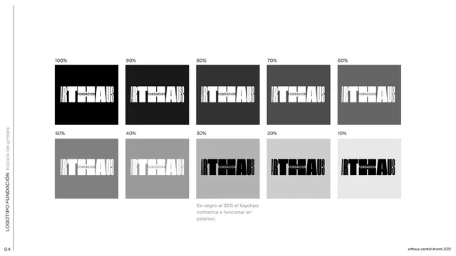
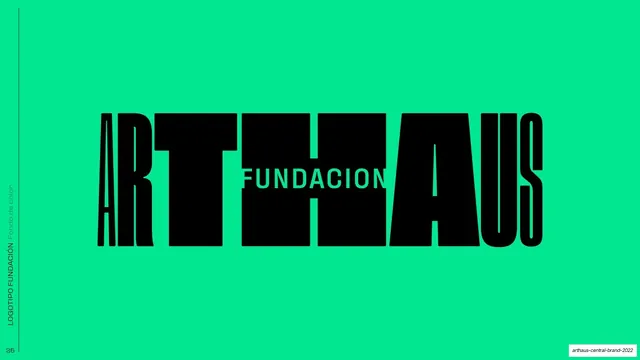
The ARTHAUS Fundacion sub-brand lockup shown positive: a massive black horizontal wordmark on white with FUNDACION reversed out of the central letters.
Summary
The positive version of the ARTHAUS Fundacion sub-brand mark: a huge black horizontal ARTHAUS logotype on white, with the word FUNDACION knocked out in white across its center.
Visual description
White full bleed with a rotated "LOGOTIPO FUNDACION / Positivo" side label up the left edge. A single oversized horizontal logotype dominates the middle: "ARTHAUS" set in a heavy black condensed display face with tightly interlocking letters, the A, R, T, H, A, U, S nearly touching. The word "FUNDACION" is reversed out in white, sitting in a narrow band through the middle of the tall T-H-A letters, integrating the sub-brand line into the body of the mark rather than below it.
Key takeaway
Building a sub-brand by knocking its name straight out of the parent logotype's center, so the endorsement reads as one unified mark instead of a stacked lockup. The extreme weight and tight spacing make the negative-space FUNDACION feel intentional.
Reuse notes
A strong pattern for foundation, division, or sub-brand endorsements where you want the parent mark to stay dominant. Needs a logotype heavy and tall enough to carry reversed text inside its strokes; thin or light marks will not work.
From this deck: ARTHAUS Fundacion logotype positive
View deck

































More like this







Keep what you find
A free account saves references to boards and can send you a weekly email of picks based on what you save.
To see every result, go Pro.