FPA studio brand guideline (v2.0)
Bilingual brand guideline for FPA (Floating Point Art) studio built on a geometric logo, Field Gothic type and a neutral palette accented by Arithmetic Blue.
48 slides · Guideline
View deck overview
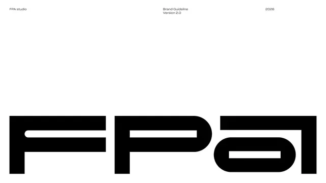
FPA cover with oversized wordmark

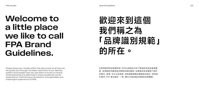
Welcome intro spread, bilingual

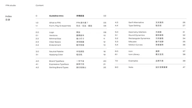
Table of contents / index

Section divider 01 Introduction

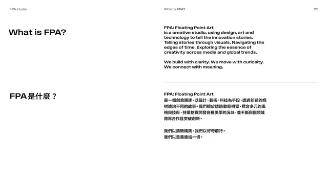
What is FPA mission text

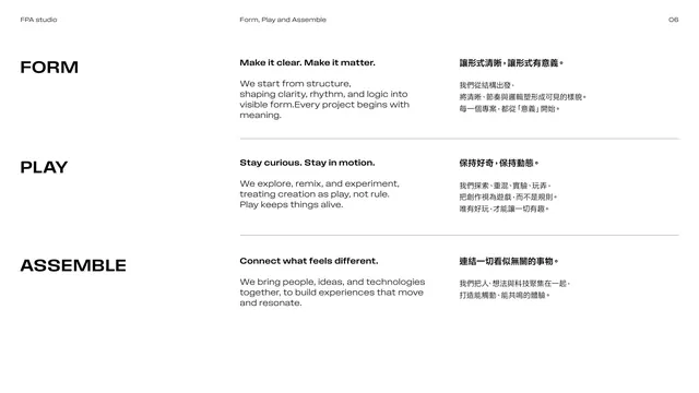
Form, Play and Assemble principles

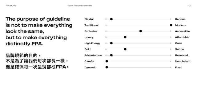
Brand attribute sliders

Section divider 02 LOGO

Logo construction rationale

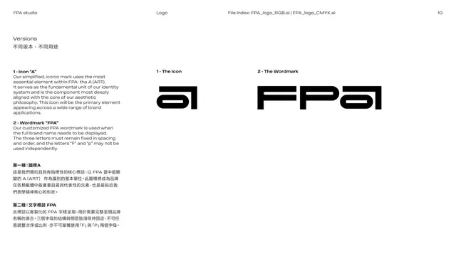
Logo versions, icon and wordmark

Logo minimum sizes

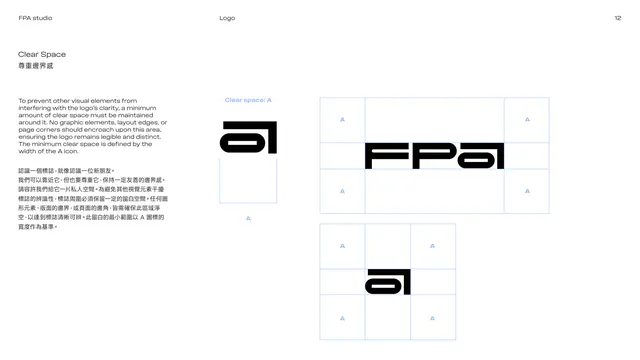
Logo clear space

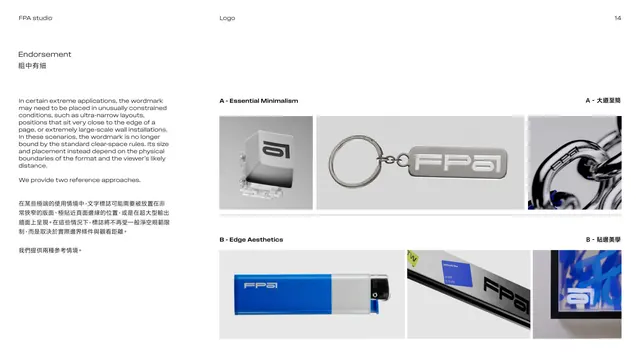
Endorsement rules, intro

Endorsement examples on products

Endorsement icon variations

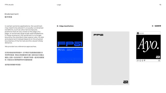
Endorsement edge applications

Section divider 03 Color

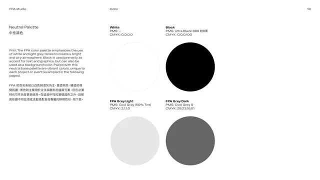
Neutral palette swatches

Applying color, proportion donut

Full color specification table

Section divider 04 Typography

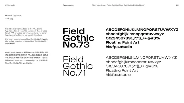
Brand typeface Field Gothic

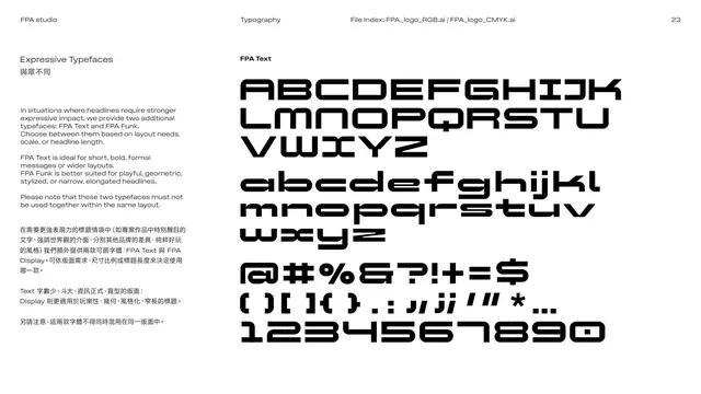
Expressive typeface FPA Text

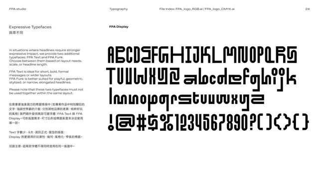
Expressive typeface FPA Display

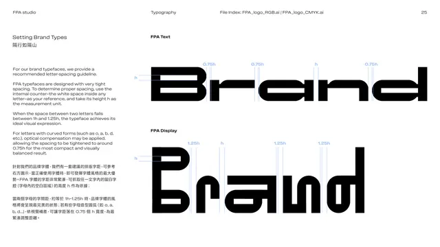
Setting brand types, letter spacing

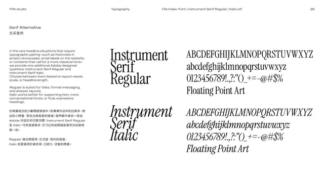
Serif alternative Instrument Serif

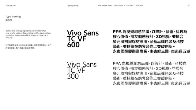
Type setting, Chinese typeface Vivo Sans

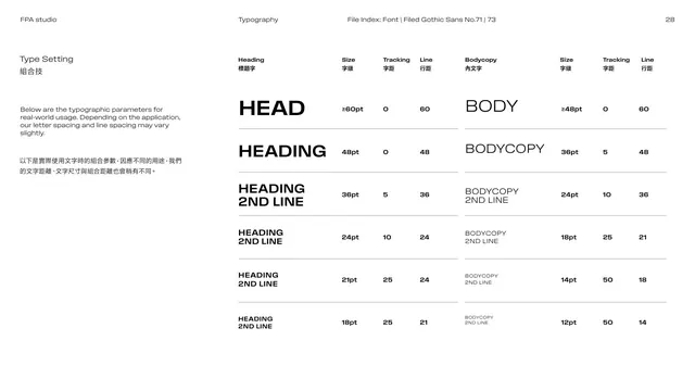
Type setting, heading and body scale

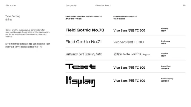
Type setting, font pairing matrix

Section divider 05 Motion

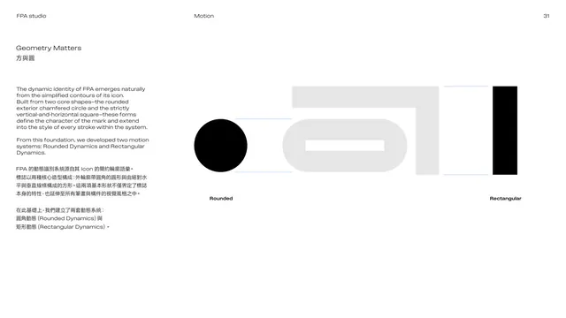
Geometry matters, two core shapes

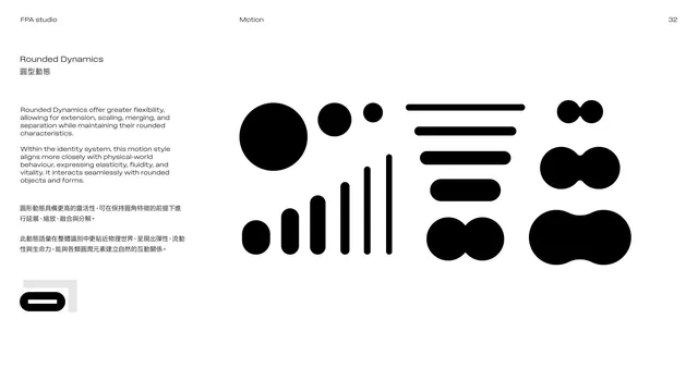
Rounded Dynamics motion family

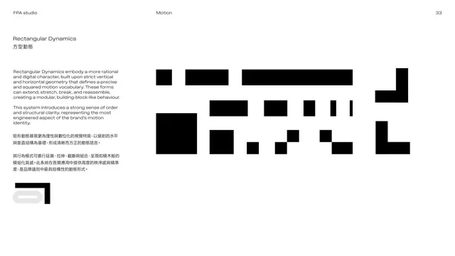
Rectangular Dynamics motion family

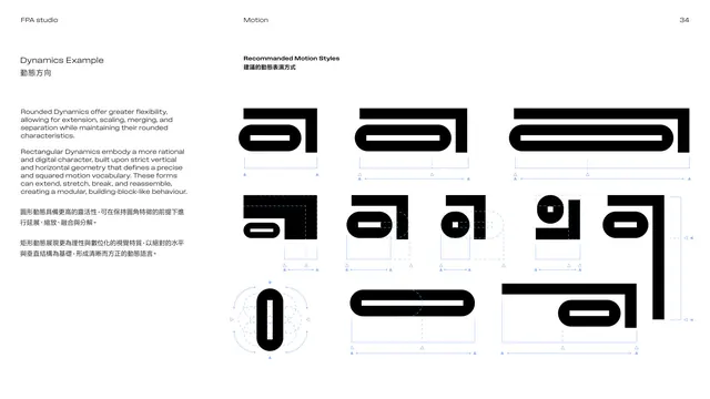
Dynamics example, recommended motion

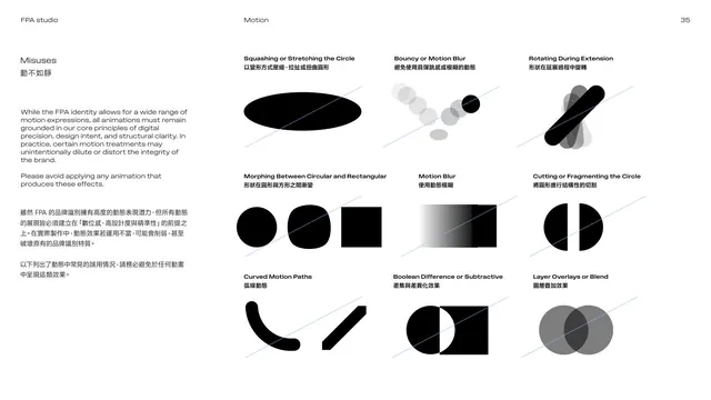
Motion misuses grid

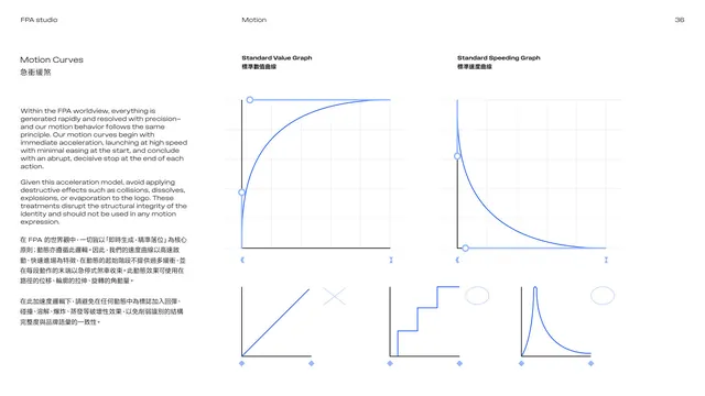
Motion curves easing graphs

Section divider 06 Icons

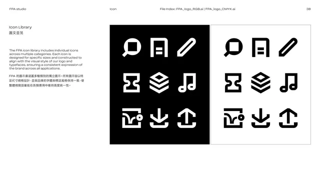
Icon library specimen

Section divider 07 Examples

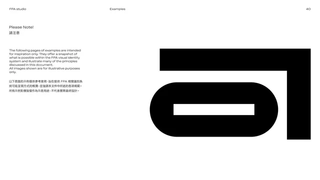
Examples please-note intro

Examples, stationery and business card

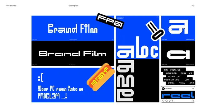
Examples, expressive type posters

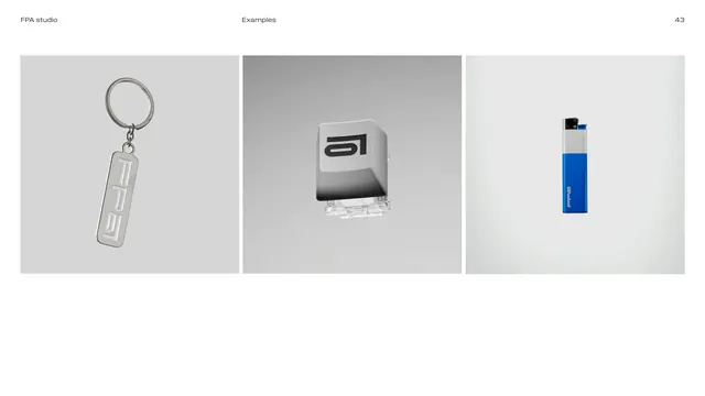
Examples, merch product shots

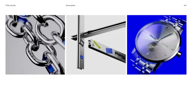
Examples, 3D chrome renders

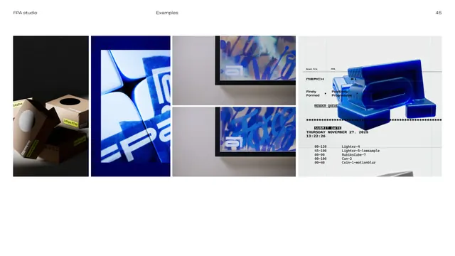
Examples, packaging and editorial mix

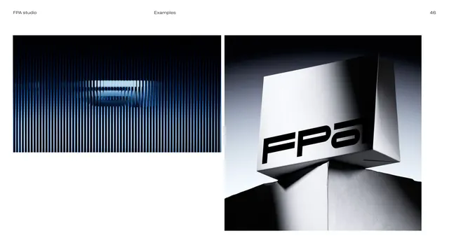
Examples, environmental and signage

Section divider 08 Notes

Closing note, Design is what makes us