Preview image. Unlock full-res
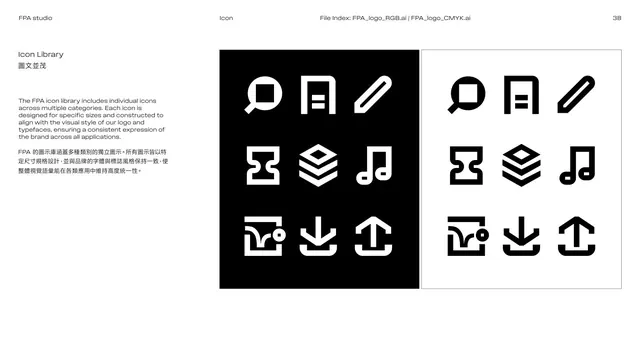
Icon-library page showing nine custom icons in a grid, presented both reversed on black and positive on white.
Summary
The icon library: a three-by-three set of custom FPA icons (search, document, pencil, frame, layers, music note, image, download, upload) shown twice, white-on-black and black-on-white, built to match the logo and type style.
Visual description
White page. The left column explains in English over Chinese that the icon library spans multiple categories, with each icon sized and constructed to align with the logo and typeface for a consistent brand expression. The right side holds two large square panels side by side: a black panel with nine white icons, and a white panel with the same nine icons in black. The icons share a heavy, geometric, squared-and-rounded style echoing the logo's stroke language. Strictly black and white.
Key takeaway
Showing the icon set in both positive and negative panels documents on-light and on-dark use at once. Drawing icons with the same stroke logic as the logo keeps the whole system visually unified.
Reuse notes
A clean icon-library reference. Reuse the dual positive/negative panel to cover both backgrounds. Design icons to share the logo's geometry so they read as one family.
From this deck: Icon library specimen
View deck










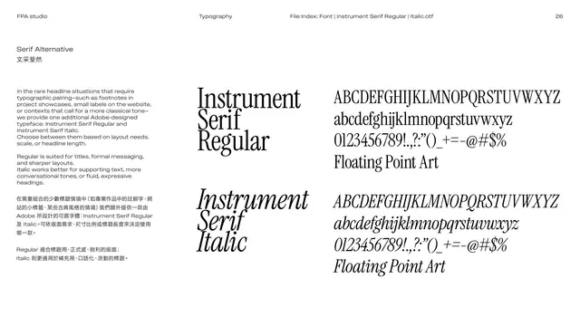
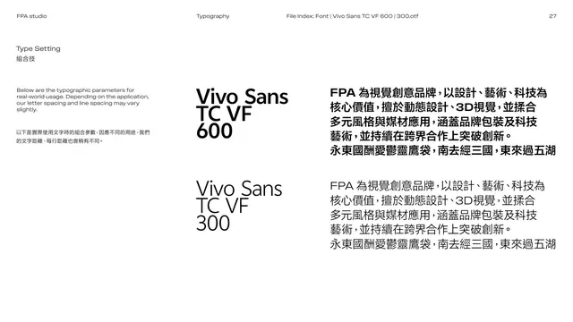
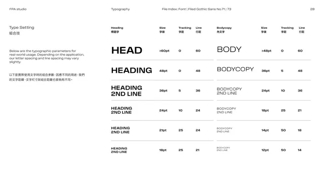
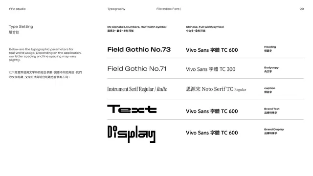






More like this





Keep what you find
A free account saves references to boards and can send you a weekly email of picks based on what you save.
To see every result, go Pro.