Preview image. Unlock full-res
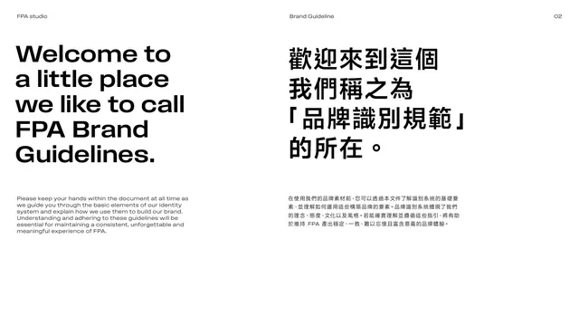
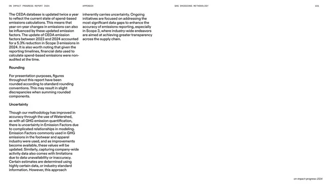
Two-column welcome page with a large English headline over its Traditional Chinese equivalent and short intro paragraphs below each.
Summary
A welcome statement set as two parallel language columns: a bold English headline "Welcome to a little place we like to call FPA Brand Guidelines" on the left, the Traditional Chinese version on the right, each with a small paragraph of intro copy beneath.
Visual description
White page, two columns. The left column carries a five-line oversized black sans-serif headline; the right column repeats it in large Traditional Chinese characters. Below each headline, separated by a deep gap, sits a short block of small body copy in the matching language explaining the purpose of the identity system. The running header reads "FPA studio", "Brand Guideline", "02". The layout is calm and text-only, relying on type scale and the language pairing for hierarchy.
Key takeaway
The side-by-side bilingual headline treatment is an elegant way to make a dual-language document feel intentional rather than bolted-on. Pairing oversized headline with a small grounded paragraph in each column creates clear two-level hierarchy with no graphics.
Reuse notes
Ideal opening spread for any bilingual guideline or report. The English-left / CJK-right convention reads naturally for mixed audiences. Keep the body copy short so the headline scale stays dominant.
From this deck: Welcome intro spread, bilingual
View deck




















More like this







Keep what you find
A free account saves references to boards and can send you a weekly email of picks based on what you save.
To see every result, go Pro.