Preview image. Unlock full-res
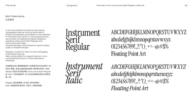
Serif-alternative page introducing Instrument Serif Regular and Italic for occasional classical-toned typesetting, with full specimens.
Summary
The serif alternative: Instrument Serif Regular and Italic, for rare headline moments needing a classical tone (footnotes, small labels, project showcases), shown as full character specimens.
Visual description
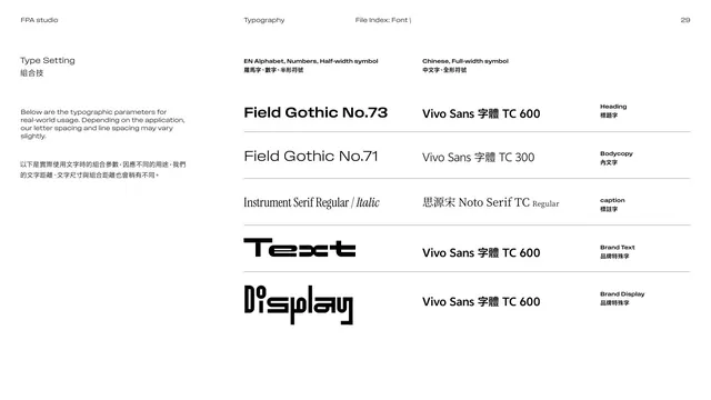
White page. The left column explains in English over Chinese that for rare headline situations needing a classical tone, one extra Adobe-designed face is provided, Instrument Serif Regular and Italic; Regular suits titles and formal messaging, Italic suits supporting, conversational or fluid headings. The right side shows two specimens: "Instrument Serif Regular" set large with its full uppercase, lowercase, numerals, punctuation and "Floating Point Art" sample; below, "Instrument Serif Italic" with the same. A high-contrast classical serif, black on white.
Key takeaway
Adding a single serif as a controlled alternative gives the otherwise geometric, technical system an occasional editorial, classical voice without diluting it. Limiting it to specific contexts (footnotes, showcases, labels) keeps the brand coherent.
Reuse notes
A good "alternative typeface" page. Pick one serif, define narrow use cases, and show both Roman and Italic. Reuse when a sans-led brand needs occasional warmth or editorial contrast.
From this deck: Serif alternative Instrument Serif
View deck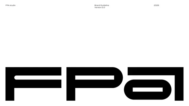










More like this




Keep what you find
A free account saves references to boards and can send you a weekly email of picks based on what you save.
To see every result, go Pro.