Preview image. Unlock full-res
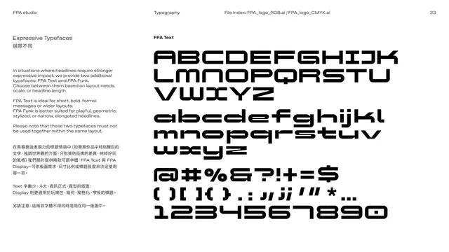
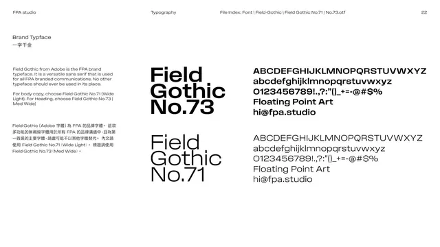
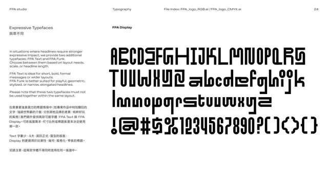
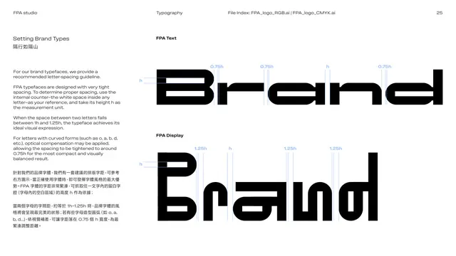
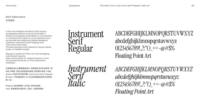
Expressive-typeface page introducing FPA Text, a wide geometric display face, shown as a full character specimen beside usage notes.
Summary
The first expressive display face, FPA Text: a wide, bold, geometric headline typeface shown as a full character set, with notes that it suits short, formal, wider headlines and must not be mixed with FPA Display.
Visual description
White page. The left column explains in English over Chinese that two extra display faces (FPA Text and FPA Display) exist for expressive headlines, that FPA Text is ideal for short bold formal messages or wide layouts, and that the two display faces must never appear together. The right side shows the "FPA Text" specimen: large uppercase A to Z, lowercase a to z, a row of symbols, and numerals 1234567890, all in a heavy, squared, retro-tech display style with cut corners. Black on white.
Key takeaway
Giving the brand a custom display face beyond the workhorse sans adds personality for headlines while the rules (short, wide, never mixed with the other display face) keep it controlled. The cut-corner geometric style reads distinctly "tech".
Reuse notes
Use a dedicated display-face page when a brand ships expressive type. State the use cases and any pairing prohibitions explicitly. Reuse the full-glyph specimen layout for clarity.
From this deck: Expressive typeface FPA Text
View deck









More like this







Keep what you find
A free account saves references to boards and can send you a weekly email of picks based on what you save.
To see every result, go Pro.