
Preview image. Unlock full-res
Logo page explaining the FPA wordmark derived from floating-point 0 and 1 forms, with the large black logotype shown at right.
Summary
The primary logo page: a left text column explains that the FPA logotype draws on the 0 and 1 symbols of floating-point computation, while the large black wordmark fills the right side.
Visual description
White page. The left column carries the heading "Logo / 標誌" and two paragraphs (English over Chinese) describing the mark's origin in floating-point 0/1 forms, its circular-exterior / squared-interior construction, and its horizontally grounded, rational, modular structure. The right two-thirds is dominated by the FPA logotype set very large in solid black. The running header notes the file index "FPA_logo_RGB.ai / FPA_logo_CMYK.ai". Heavy geometric strokes, with the "a" reading as a circle-outside, rectangle-inside form.
Key takeaway
Tying the logo's geometry to a concept (the 0 and 1 of floating-point math) gives the mark a memorable rationale. Showing the wordmark huge alongside the explanation lets the reader read and see the forms at once.
Reuse notes
Standard primary-logo page: rationale left, large mark right. The concept-driven explanation is worth emulating when a wordmark has a genuine conceptual hook. Including the source filenames in the header is a nice production touch.
From this deck: Logo construction rationale
View deck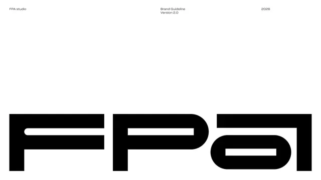









More like this








Keep what you find
A free account saves references to boards and can send you a weekly email of picks based on what you save.
To see every result, go Pro.