Preview image. Unlock full-res
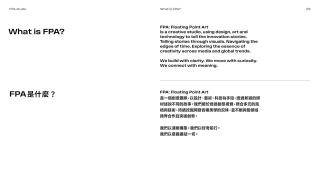
Bilingual mission page with a left heading and a right column of bold English statement copy over its Chinese translation.
Summary
A "What is FPA?" page defining the studio: a section heading on the left, with the brand statement set in bold English and repeated in Chinese, divided by a hairline, in the right columns.
Visual description
White page. Left column holds the heading "What is FPA?" and below it the Chinese "FPA 是什麼?". The right side carries the statement: a bold paragraph opening "FPA: Floating Point Art is a creative studio, using design, art and technology to tell the innovation stories," followed by short manifesto lines ("We build with clarity. We move with curiosity. We connect with meaning."). A thin horizontal rule separates the English block from the Chinese translation directly beneath it. All copy is set in the bold weight of the brand sans.
Key takeaway
Setting the core brand statement in the bold weight (rather than light body text) gives the manifesto weight and conviction. The hairline divider cleanly stacks the two language versions of the same statement.
Reuse notes
Good model for an "about / mission" page in a bilingual guideline. The repeated-bold treatment suits short manifesto copy; do not use it for long-form text where it would tire the reader.
From this deck: What is FPA mission text
View deck









More like this







Keep what you find
A free account saves references to boards and can send you a weekly email of picks based on what you save.
To see every result, go Pro.