Preview image. Unlock full-res
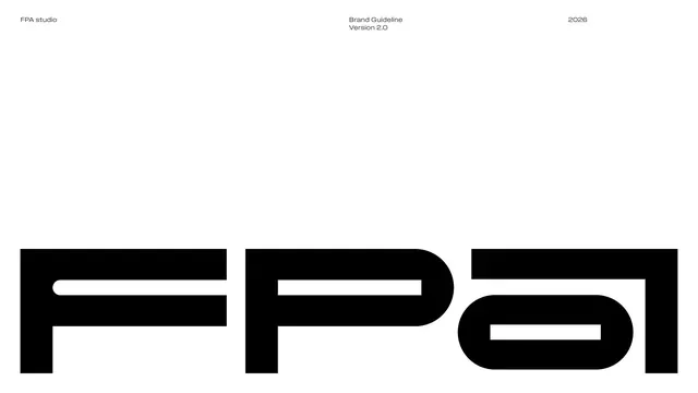
Cover page with the heavy FPA wordmark spanning the lower third on white, headed by studio name, title and year.
Summary
The guideline cover: a single massive black FPA wordmark anchored to the lower portion of an otherwise empty white page, with small meta text along the top edge.
Visual description
White full-bleed page. A thin top row of metadata runs edge to edge: "FPA studio" at top-left, "Brand Guideline / Version 2.0" centered, "2026" at top-right, all in small grey sans-serif. The lower third is filled by the FPA logotype set extremely large in solid black, the letters built from heavy geometric strokes (circular outer curves, squared interior counters). Vast white space separates the header from the logo, giving the mark maximum presence.
Key takeaway
Letting one oversized logotype carry an entire cover with nothing but a thin metadata strip is a confident, minimal move. The contrast between tiny functional header text and the giant mark sets the document's editorial tone immediately.
Reuse notes
A reliable template for any guideline or report cover where the logo is strong enough to stand alone. Works best when the mark has real structural character; on a plain background it needs the surrounding white space to breathe.
From this deck: FPA cover with oversized wordmark
View deck





















More like this






Keep what you find
A free account saves references to boards and can send you a weekly email of picks based on what you save.
To see every result, go Pro.