Preview image. Unlock full-res
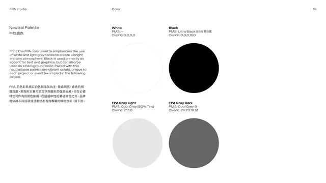
Neutral-palette page presenting White, Black and two cool greys as large circles with PMS and CMYK values.
Summary
The neutral base palette: White, Black, FPA Grey Light and FPA Grey Dark shown as four large color circles, each with its PMS and CMYK build, with a note that vibrant accent colors are added per project.
Visual description
White page. The left column explains in English over Chinese that the palette leans on white and light grey for a bright, airy feel, with black as accent (or background) and per-project vibrant accents added later. The right side is a two-by-two arrangement of large filled circles: White (outline only, CMYK 0,0,0,0), Black (Ultra Black 888, CMYK 0,0,0,100), FPA Grey Light (Cool Grey 50% tint) and FPA Grey Dark (Cool Grey 9), each with its name, PMS and CMYK values in small bold labels above.
Key takeaway
Anchoring an identity in a disciplined neutral set, then layering one project-specific accent, is a flexible, durable color strategy. Big circular swatches with full print specs read cleanly and professionally.
Reuse notes
A solid neutral-palette page. Naming greys as branded tokens (FPA Grey Light / Dark) makes them feel deliberate. State the print builds for production; pair with the accent-color page that follows.
From this deck: Neutral palette swatches
View deck


















More like this







Keep what you find
A free account saves references to boards and can send you a weekly email of picks based on what you save.
To see every result, go Pro.