
Preview image. Unlock full-res
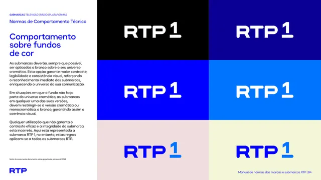
Six-tile grid showing the RTP mark reversed white, or in blue, across black, navy, blue and pale backgrounds to demonstrate contrast rules.
Summary
The rule for placing the mark on color backgrounds ("Comportamento sobre fundos de cor"), shown as a grid of color tiles each carrying the RTP wordmark.
Visual description
The left white column carries the head and black paragraphs explaining the mark should usually be white over the brand's chromatic universe, and restricted to the chromatic or white monochrome version when the background falls outside the palette. The right two-thirds is a six-tile grid (two columns, three rows): black, navy and bright-blue tiles carry the white wordmark; a lighter blue tile carries white; a pale pink and a pale cream tile carry the blue wordmark. The arrangement steps from dark grounds (white mark) to light grounds (blue mark).
Key takeaway
A simple do-grid that demonstrates contrast logic by example rather than prose: dark grounds get the white mark, light grounds get the blue. Sequencing the tiles dark-to-light reinforces the rule visually.
Reuse notes
A reusable "logo on backgrounds" page. Reach for it to show, in one view, how a mark switches between reversed and positive across a range of grounds. Keep the tiles ordered by value so the switching point is obvious.
From this deck: Behavior on color backgrounds
View deck




































































More like this








Keep what you find
A free account saves references to boards and can send you a weekly email of picks based on what you save.
To see every result, go Pro.