Preview image. Unlock full-res
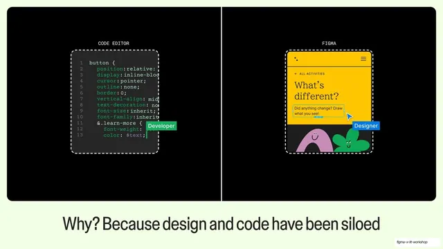
Mint-framed black card split into a CODE EDITOR mockup and a FIGMA mockup, each with a role tag, captioned about design and code being siloed.
Summary
A mint-framed black card split into two dashed-outlined panels, a code editor on the left and a yellow Figma canvas on the right, each tagged with a role, captioned about design and code being siloed.
Visual description
Pale mint-green (#E8FCC2) full-bleed framing a centered black rounded rectangle, divided down the middle by a thin vertical rule. The left half is labelled "CODE EDITOR" in monospace and shows a dark code panel with numbered lines of CSS for a "button" rule, tagged with a green "Developer" chip. The right half is labelled "FIGMA" and shows a yellow mobile app mock ("What's different?") with two playful blob mascots, tagged with a blue "Designer" chip and a cursor. Both panels sit inside dashed selection outlines. The dark caption below reads: "Why? Because design and code have been siloed".
Key takeaway
Putting the two disciplines literally side by side inside one framed card, each in its own dashed boundary with a role chip, to visualize the silo. The matched eyebrow labels (CODE EDITOR / FIGMA) make the split instantly readable.
Reuse notes
A clean comparison layout any time you need to contrast two tools, roles, or states. The dashed outlines and role chips imply Figma selection, so they suit design-tooling talks; drop them for a more neutral comparison.
From this deck: Code editor vs Figma siloed split
View deck







More like this









Keep what you find
A free account saves references to boards and can send you a weekly email of picks based on what you save.
To see every result, go Pro.