Preview image. Unlock full-res
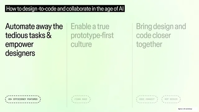
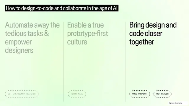
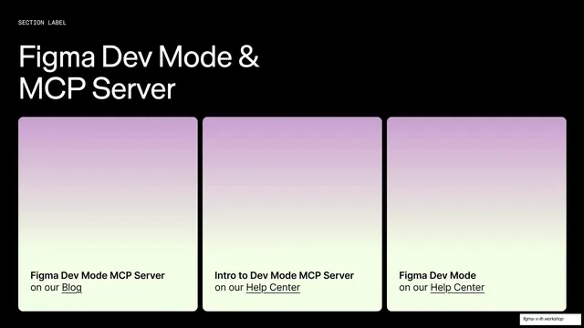
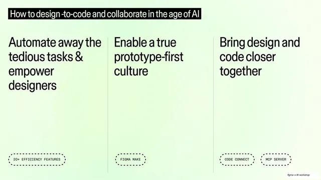
Pale-mint three-column overview of the three workshop themes, each a large heading over a dashed feature tag, under a black title bar.
Summary
A pale-mint overview slide laying out the workshop's three themes as equal columns, each a large heading anchored by a dashed all-caps feature tag, beneath a black title bar.
Visual description
Soft mint-green gradient background. A black title bar with white text spans the top: "How to design-to-code and collaborate in the age of AI". Below, three equal columns separated by thin vertical rules. Each column holds a large black sans-serif heading at the top ("Automate away the tedious tasks & empower designers", "Enable a true prototype-first culture", "Bring design and code closer together") and a dashed-outline pill tag at the bottom in monospaced all-caps ("20+ EFFICIENCY FEATURES", "FIGMA MAKE", "CODE CONNECT", "MCP SERVER"). All three columns are fully visible and equally weighted.
Key takeaway
A clean agenda built as three equal text columns with the supporting label parked at the foot of each column inside a dashed pill. The black title bar gives a soft pastel slide a crisp anchor. This is the master layout the next slides progressively highlight.
Reuse notes
Ideal as a "here are our three themes" overview that you then revisit by dimming two columns and lighting one (as the following slides do). The dashed monospaced tags are a nice way to footnote each theme with its feature name. Works on any light gradient.
From this deck: How to design-to-code, three-column theme overview
View deck