Preview image. Unlock full-res
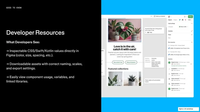
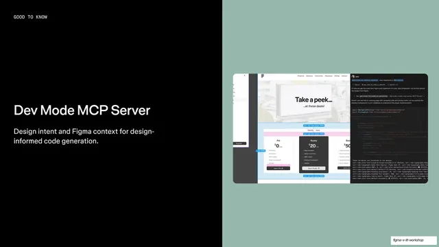
Split feature slide on developer resources, with an arrow-bulleted list on black left and a Dev Mode inspect panel screenshot on a bright cyan panel right.
Summary
A developer-resources feature slide: black left column listing what devs can extract from Figma as arrow bullets, with a Dev Mode inspect-panel screenshot on a bright cyan panel bleeding off the right.
Visual description
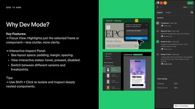
The slide splits left and right. The black left half carries a "GOOD TO KNOW" monospace eyebrow, a white "Developer Resources" headline, a "What Developers See:" subhead, and three white arrow bullets: inspectable CSS/Swift/Kotlin values, downloadable assets with correct naming and export settings, and easy view of component usage, variables, and linked libraries. The right half is a saturated cyan panel holding a Figma Dev Mode screenshot, a plant-shop design with the Inspect side panel, dev resources, and a version history, cropped by the slide edge.
Key takeaway
The same feature template, now on a vivid cyan panel proving the Dev Mode handoff surface. Rotating the panel hue per feature keeps a long capability run visually distinct while the left-column structure stays constant.
Reuse notes
Continues the feature run with a high-saturation panel for a developer-focused capability. Strong for showing a dev tool's inspect or handoff view. The cyan is loud; reserve the brightest panels for the most important features so color tracks emphasis.
From this deck: Developer Resources Dev Mode feature
View deck









More like this



Keep what you find
A free account saves references to boards and can send you a weekly email of picks based on what you save.
To see every result, go Pro.