Preview image. Unlock full-res
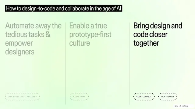
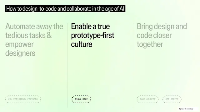
The three-theme overview with the middle column (Enable a true prototype-first culture) in full black and the outer two dimmed to grey.
Summary
The three-theme overview advanced one step: the middle column "Enable a true prototype-first culture" is now full black while the left and right columns dim to grey.
Visual description
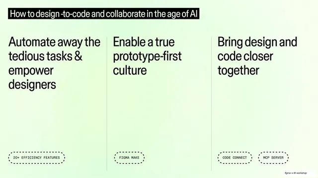
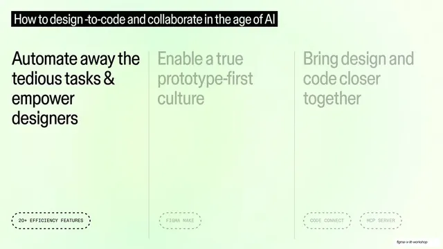
Same mint-green gradient, black top title bar, three columns and vertical rules as the base overview. This time only the middle column ("Enable a true prototype-first culture") and its dashed "FIGMA MAKE" tag are solid black; the left column ("Automate away...", "20+ EFFICIENCY FEATURES") and the right column ("Bring design and code closer together", "CODE CONNECT", "MCP SERVER") are dimmed to pale grey.
Key takeaway
The continuation of the dim-to-focus device: moving the single black-strength column from left to middle keeps the audience oriented in the same map while signaling progress. The structure never changes, only which column is lit.
Reuse notes
The middle beat of a three-part agenda walk. Pair with the matching overview and the other highlighted variants so the set reads as one progressive system. Keep the dashed tags and title bar identical across all three to make the focus shift the only thing that moves.
From this deck: Three-column overview with second theme active
View deck