Preview image. Unlock full-res
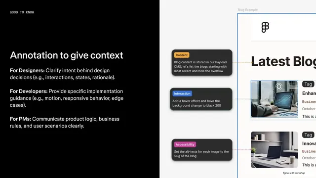
Split feature slide on annotations, with role-based guidance on black left and a Figma blog mockup with colored annotation tooltips on a gray panel right.
Summary
An annotations feature slide: black left column with per-role guidance, and a Figma blog-page mockup peppered with colored annotation tooltips on a gray panel bleeding off the right.
Visual description
The slide splits left and right. The black left half carries a "GOOD TO KNOW" monospace eyebrow, a white "Annotation to give context" headline, and three bolded role lines with explanatory text: "For Designers" (clarify intent), "For Developers" (implementation guidance), "For PMs" (product logic and rules). The right half is a light gray panel showing a "Blog Example" Figma mockup with a large "Latest Blog" heading; three dark annotation tooltips with colored category chips ("Content" yellow, "Interaction" blue, "Accessibility" pink) connect to the design by dashed leader lines, partially cropped by the slide edge.
Key takeaway
Pairing a per-audience text breakdown on the left with a live example of the feature in action on the right, complete with color-coded annotation chips and dashed leader lines. The chips give annotations a clear taxonomy at a glance.
Reuse notes
Continues the feature template with a neutral gray panel. The dashed-leader annotation callouts are a reusable device for explaining any UI in screenshots. Good when a feature benefits multiple roles differently; the bolded role labels carry that structure cleanly.
From this deck: Annotation to give context feature
View deck

















More like this







Keep what you find
A free account saves references to boards and can send you a weekly email of picks based on what you save.
To see every result, go Pro.