Preview image. Unlock full-res
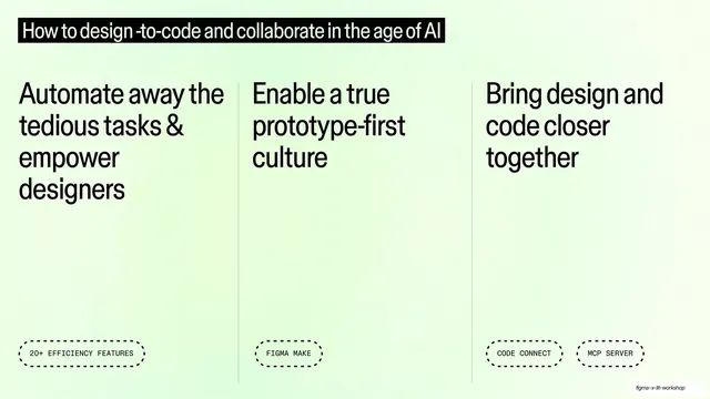
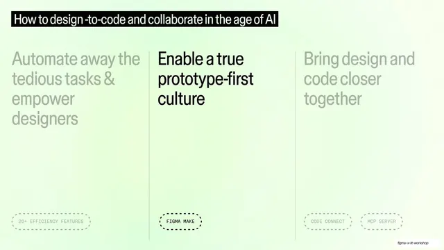
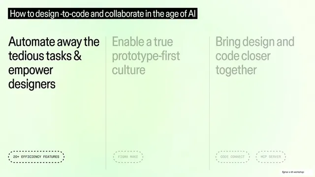
The three-theme overview layout with the first column (Automate away the tedious tasks) at full black and the other two dimmed to grey.
Summary
The same three-theme overview, now in focus mode: the first column is full black while the other two fade to light grey, signaling which theme is being discussed.
Visual description
Identical mint-green gradient and black top title bar as the overview slide. The three columns and vertical rules remain, but only the left column ("Automate away the tedious tasks & empower designers") and its dashed "20+ EFFICIENCY FEATURES" tag are in solid black. The middle and right columns ("Enable a true prototype-first culture", "Bring design and code closer together") and their tags are dimmed to a pale grey, pushing them into the background.
Key takeaway
The progressive-highlight move: keep one fixed overview layout and simply dim the non-active columns to grey so the audience always sees the whole structure and the current focus at once. No new slide structure needed, just a contrast shift.
Reuse notes
Use as a recurring waypoint between deeper content slides, returning to the same agenda and lighting whichever theme is next. Requires the matching full-strength overview slide as its base. The grey dim must be light enough to clearly recede but still legible.
From this deck: Three-column overview with first theme active
View deck