Preview image. Unlock full-res
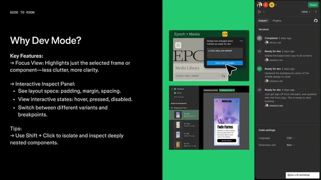
Split feature slide on Dev Mode, with a key-features and tips list on black left and Dev Mode inspect screenshots plus version history on a green panel right.
Summary
A Dev Mode feature slide: black left column of key features and a tip, with two Figma Dev Mode screenshots and a version-history panel on a bright green panel bleeding off the right.
Visual description
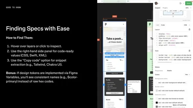
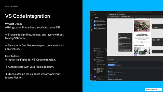
The slide splits left and right. The black left half carries a "GOOD TO KNOW" monospace eyebrow, a white "Why Dev Mode?" headline, a "Key Features:" subhead with arrow bullets for Focus View and an "Interactive Inspect Panel" (with sub-bullets for layout specs, interactive states, variants and breakpoints), and a "Tips:" line about Shift+Click to isolate nested components. The right half is a saturated green panel holding two stacked Dev Mode screenshots (an "Epoch Media" library and a shopping-cart flow with a "Twin Farms" mock) plus a vertical version-history list with "Ready for dev" entries, cropped by the slide edge.
Key takeaway
The same feature template carrying a denser payload: a nested bullet list with sub-points on the left, and multiple screenshots plus a version-history rail on the right to prove the workflow end to end. Sub-bullets let one feature slide hold a lot without losing the structure.
Reuse notes
Closes this feature run on a green panel and the densest content of the set; good when a flagship feature needs more than three bullets and more than one screenshot. Watch density, this is near the upper limit before the left column feels crowded. The version-history rail is a reusable way to show review state.
From this deck: Why Dev Mode feature with version history
View deck

More like this

Keep what you find
A free account saves references to boards and can send you a weekly email of picks based on what you save.
To see every result, go Pro.