Preview image. Unlock full-res
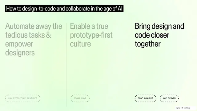
The three-theme overview with the right column (Bring design and code closer together) in full black and the left two dimmed to grey.
Summary
The final step of the three-theme overview: the right column "Bring design and code closer together" is full black while the left and middle columns dim to grey.
Visual description
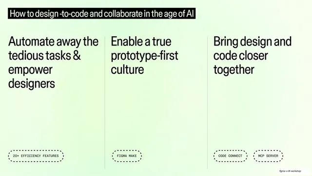
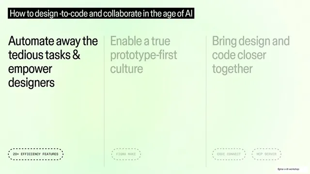
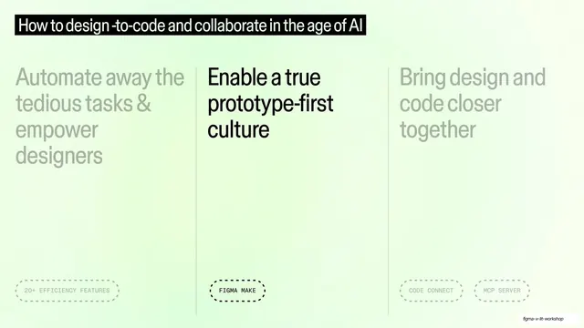
Same mint-green gradient, black top title bar, three columns and vertical rules as the base overview. Now the right column ("Bring design and code closer together") with its two dashed tags "CODE CONNECT" and "MCP SERVER" is solid black; the left column ("Automate away...", "20+ EFFICIENCY FEATURES") and the middle column ("Enable a true prototype-first culture", "FIGMA MAKE") are dimmed to pale grey.
Key takeaway
Closing the progressive-highlight loop by lighting the third and last column, so the three overview variants together act as chapter markers across the deck. The fixed map plus a moving spotlight is the whole idea.
Reuse notes
The third waypoint in the agenda walk. Use the set of overview variants as bookends around each theme's content. Because this column carries two feature tags, it shows the layout flexing to more than one dashed pill while staying balanced.
From this deck: Three-column overview with third theme active
View deck