Preview image. Unlock full-res
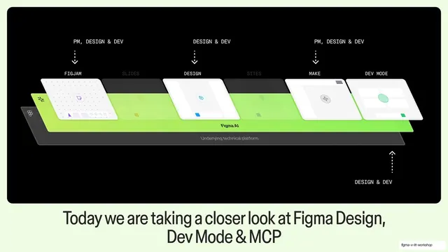
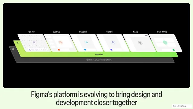
The Figma isometric stack reused with FigJam, Design, Make, and Dev Mode highlighted and audience labels above, captioned about today's focus.
Summary
The same isometric Figma stack as the prior slide, now dimming the unused surfaces and spotlighting FigJam, Design, Make, and Dev Mode with audience tags and dashed pointer arrows, captioned about today's focus.
Visual description
Full-bleed black with the identical isometric row of product cards over the lime-green "Figma AI" plane. Here "SLIDES" and "SITES" are greyed back while "FIGJAM", "DESIGN", "MAKE", and "DEV MODE" stay bright. Small all-caps monospace labels float above with dashed downward arrows pointing to each active surface: "PM, DESIGN & DEV", "DESIGN & DEV", "PM, DESIGN & DEV"; a fourth dashed arrow points up to "DEV MODE" with "DESIGN & DEV". The white caption below reads: "Today we are taking a closer look at Figma Design, Dev Mode & MCP".
Key takeaway
Reusing an established diagram and then dimming the irrelevant parts while annotating the relevant ones with dashed audience callouts. The audience tags ("PM, DESIGN & DEV") double as a who-cares legend without extra copy.
Reuse notes
A clean way to scope a talk: show the full system once, then highlight the subset you will cover. Reuse the exact base diagram so the focus shift is obvious. The dashed-arrow callout pattern is reusable for pointing at any element in a system render.
From this deck: Today's focus highlighted stack
View deck







More like this







Keep what you find
A free account saves references to boards and can send you a weekly email of picks based on what you save.
To see every result, go Pro.