Preview image. Unlock full-res
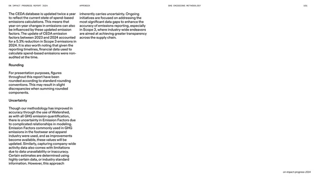
Sparse light appendix continuation page with two columns of running text and bold subheads in the upper-left, leaving most of the frame empty.
Summary
A continuation of the methodology section: two columns of small black running text with bold subheads (Rounding, Uncertainty) in the upper-left of an otherwise empty white slide.
Visual description
A white slide carrying the tiny all-caps running header ("ON IMPACT PROGRESS REPORT 2024", centered "APPENDIX", right "GHG EMISSIONS METHODOLOGY", page number "101") on a faint top rule. The content is a spill-over of body copy from the previous page: two narrow justified columns at the upper-left, with bold run-in subheads "Rounding" and "Uncertainty" introducing short paragraphs. The right half and the entire lower portion of the slide are blank white.
Key takeaway
Letting a text section end honestly on a short page rather than padding it: the copy stops where it stops and the rest of the slide stays empty white. The persistent running header (now naming the active sub-section, "GHG EMISSIONS METHODOLOGY") keeps the reader oriented across multi-page text.
Reuse notes
Reusable as a continuation page in a text-heavy appendix. The large whitespace is a feature, not a flaw, signaling the end of a topic. Keep the running header's section label updated so multi-page sections remain navigable.
From this deck: Methodology continued, rounding and uncertainty
View deck