Preview image. Unlock full-res
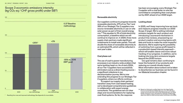
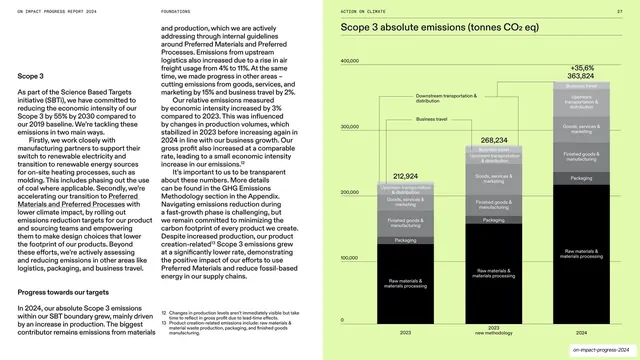
Spread with a lime-green page holding a grayscale bar chart of Scope 3 economic emissions intensity on the left and three columns of subheaded body copy on white at the right.
Summary
A data spread that flips the format: the lime page with a grayscale bar chart of economic emissions intensity sits on the left, and three columns of subheaded copy fill the white right page.
Visual description
The left page is saturated lime, carrying a grayscale vertical bar chart titled "Scope 3 economic emissions intensity (kg CO2 eq / CHF gross profit) under SBTi." Bars are annotated with percentage change labels ("+26%*," "+3%," "-55% vs. 2019 (SBT goal)") against a dashed "0.37 Baseline methodology" reference line and a light y-axis. The right page is white and breaks into three text columns under bold subheads ("Renewable electricity," "Coal phase-out," "Looking ahead"), with a numbered footnote at the foot. The all-caps running header crosses the top.
Key takeaway
Alternating which side the lime chart lands on (here left, elsewhere right) to keep a long data run from feeling mechanical, while the system stays consistent. The dashed baseline plus per-bar percentage labels make a target-versus-actual story read at a glance.
Reuse notes
A good model for target-tracking charts where a baseline and goal must sit alongside actuals. The three-column subheaded text page is a flexible way to fit several short topics opposite one chart. Vary the chart's page side across the section for rhythm, but hold the grayscale-on-lime styling and running header constant.
From this deck: Scope 3 economic intensity bar chart with three-column text
View deck






























































More like this





Keep what you find
A free account saves references to boards and can send you a weekly email of picks based on what you save.
To see every result, go Pro.