Preview image. Unlock full-res
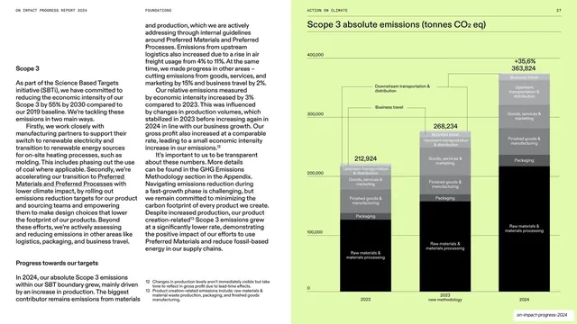
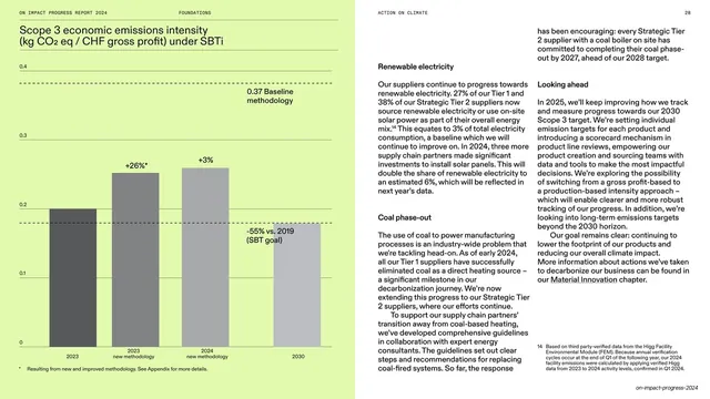
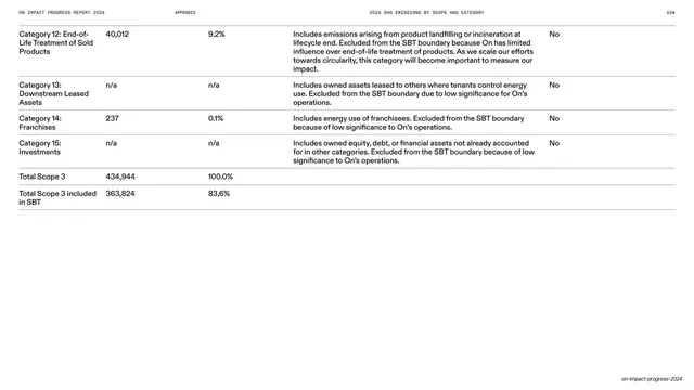
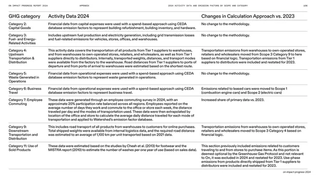
Spread with two dense body columns on white facing a lime-green page holding a large grayscale stacked bar chart of Scope 3 absolute emissions across three years.
Summary
A data spread: two columns of explanatory copy on white, facing a lime page with a tall grayscale stacked bar chart comparing Scope 3 emissions across 2023, a restated 2023, and 2024.
Visual description
The left page is white with a "Scope 3" subhead opening two narrow body columns of dense copy, underlined inline terms, and numbered footnotes at the bottom. The right page is saturated lime, carrying a large grayscale stacked bar chart titled "Scope 3 absolute emissions (tonnes CO2 eq)." Three bars (212,924; 268,234; and 363,824 with a "+35.6%" callout) are each split into stacked, in-bar labeled segments (Raw materials and processing, Packaging, Finished goods manufacturing, Goods/services/marketing, Business travel, and upstream transport), with a light value axis at left. The all-caps running header spans the top.
Key takeaway
The matched-system data spread: explanatory columns on white, one large grayscale stacked bar on the brand-color page, with category labels placed inside the bands and a single bold growth callout. It keeps a complicated multi-category, multi-year comparison legible without a busy legend.
Reuse notes
Ideal for emissions, cost, or revenue breakdowns where each total must also decompose into parts across time. Reuse the in-bar labeling and the single percentage callout to flag the headline change. Keep this chart visually identical to the deck's other lime data spreads (same grayscale ramp, same axis style) so readers learn the format once.
From this deck: Scope 3 absolute emissions stacked bar on lime
View deck
































More like this





Keep what you find
A free account saves references to boards and can send you a weekly email of picks based on what you save.
To see every result, go Pro.