
Preview image. Unlock full-res
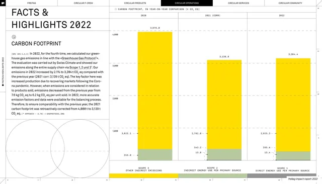
Spread with a big-figure headline plus two body columns on a white left page and a lime-green right page holding a grayscale stacked bar chart of 2024 emissions.
Summary
A data spread led by an oversized "+13%" figure and explanatory columns on white, facing a lime-green page with a grayscale stacked bar comparing 2023 and 2024 emissions.
Visual description
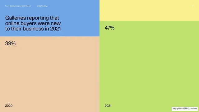
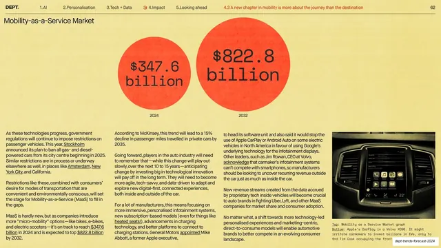
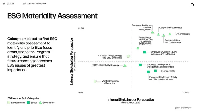
The left page is white. An oversized headline stacks "+13% / Scope 1 and 2 emissions compared to 2023" on a hairline rule, with a bold "Scope 1 and 2" subhead opening two narrow body columns below and small numbered footnotes at the foot. The right page is saturated lime. It carries a grayscale stacked bar chart titled "Scope 1 and 2 emissions for 2024 (tonnes CO2 eq)," with two columns (2023 at 1,026 and 2024 at 1,158) segmented into labeled bands (Vehicles, Gas combustion, Refrigerants, District heating, Purchased electricity) and a light y-axis scale. The all-caps running header spans the top.
Key takeaway
Leading a stat-driven spread with one oversized percentage so the takeaway lands before any reading begins, then proving it with a single clean stacked bar on the brand-color page. The matched grayscale band labels make the comparison instantly readable.
Reuse notes
A strong pattern for KPI or year-over-year pages in reports and pitch decks. Reuse the big-number headline plus body-column plus facing-chart layout for any "metric went up/down" story. Keep the chart grayscale on the color field to match sibling data spreads, and label segments directly rather than relying on a separate legend.
From this deck: Plus 13 percent Scope 1 and 2 stacked bar on lime
View deck



















































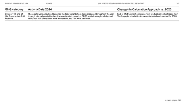
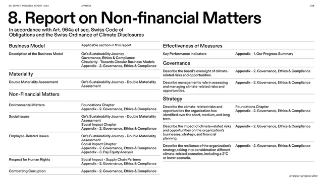
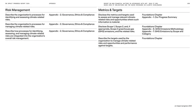
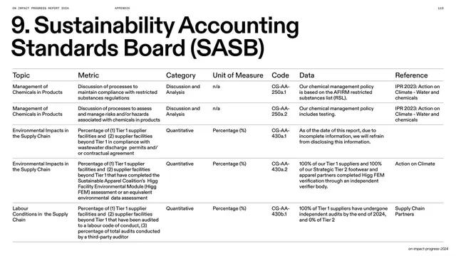


More like this





Keep what you find
A free account saves references to boards and can send you a weekly email of picks based on what you save.
To see every result, go Pro.