Preview image. Unlock full-res
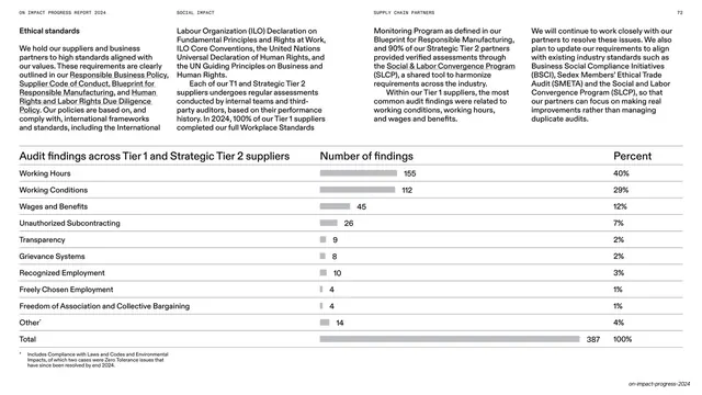
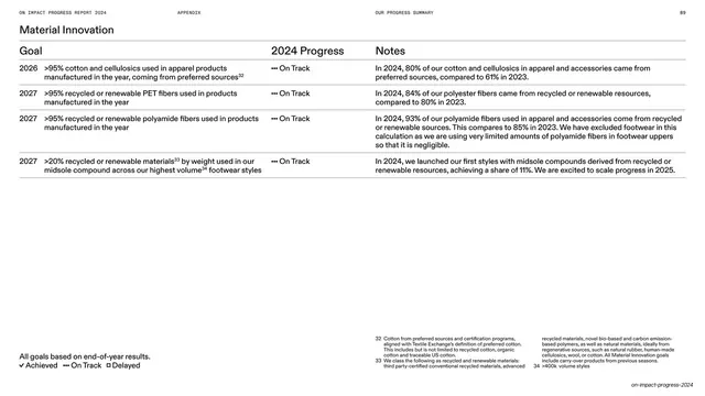
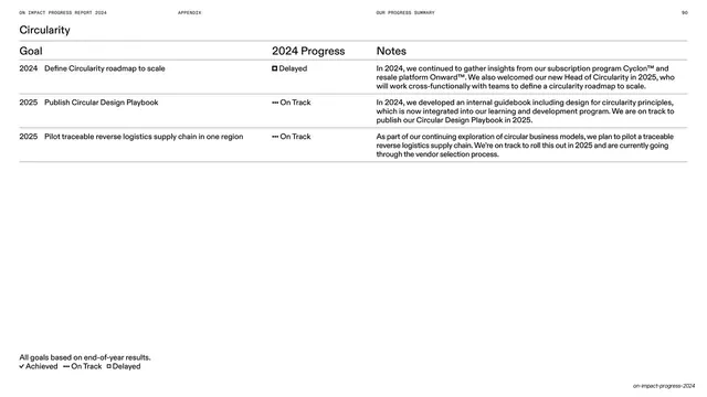
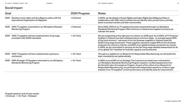
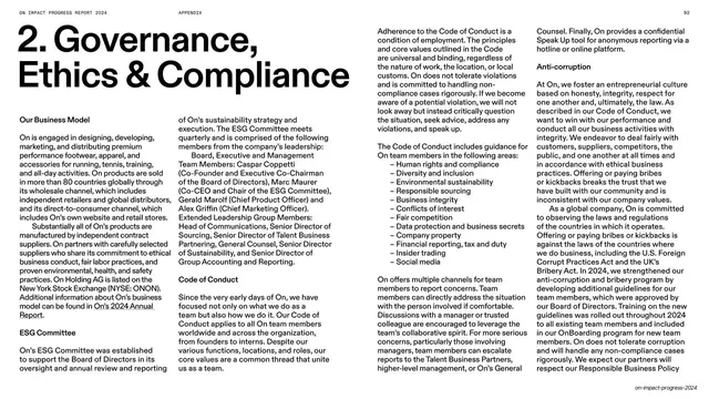
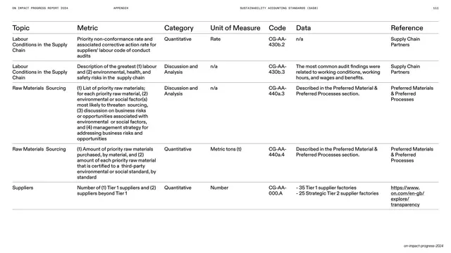
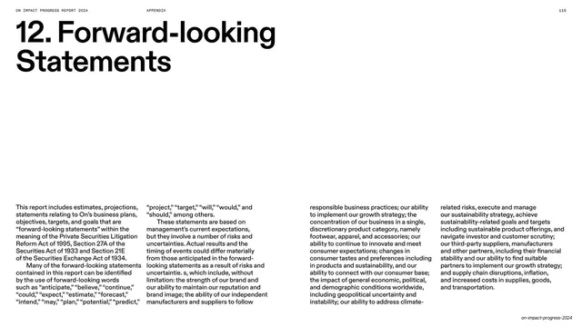
White spread with four columns of intro copy above a horizontal bar table ranking audit findings by count and percent.
Summary
A white data slide whose top is four columns of intro copy and whose bottom is a horizontal bar table ranking supplier audit findings by count and percent, ending in a totals row.
Visual description
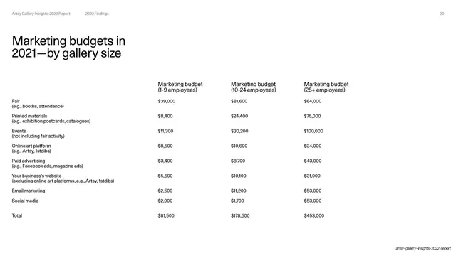
White background, standard hairline running header, page "72". The upper third is four columns of small justified body copy under a "Ethical standards" sub-head, with a few underlined link phrases. A rule separates it from a table titled "Audit findings across Tier 1 and Strategic Tier 2 suppliers", with column heads "Number of findings" and "Percent". Each row is a finding category (Working Hours, Working Conditions, Wages and Benefits, and so on) with a light-gray horizontal bar scaled to its value, the count beside the bar, and the percentage at the right; a bold "Total" row (387 / 100%) closes it. A footnote sits beneath. Footer credit bottom-right.
Key takeaway
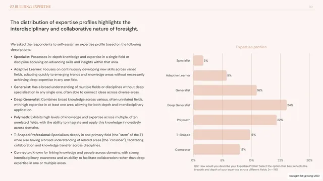
Combining a ranked data table with inline horizontal bars so the table doubles as a chart: the eye scans bar length while exact counts and percentages stay readable. Stacking four columns of context above it keeps the methodology with the numbers.
Reuse notes
The go-to for audit results, survey breakdowns, or any "categories ranked by magnitude" data. Monochrome bars keep it sober for a compliance context. Sort rows by value so the bar staircase reads cleanly, and always show a totals row.
From this deck: Audit findings horizontal bar table
View deck

































































More like this







Keep what you find
A free account saves references to boards and can send you a weekly email of picks based on what you save.
To see every result, go Pro.