Preview image. Unlock full-res
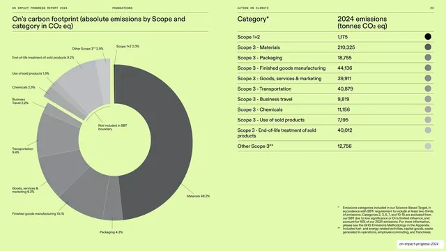
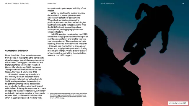
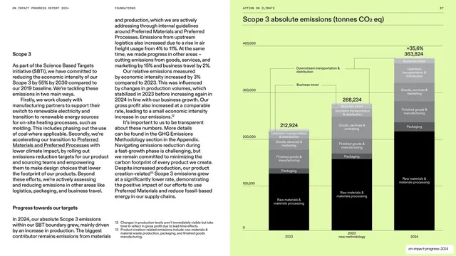
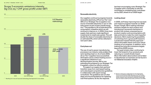
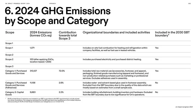
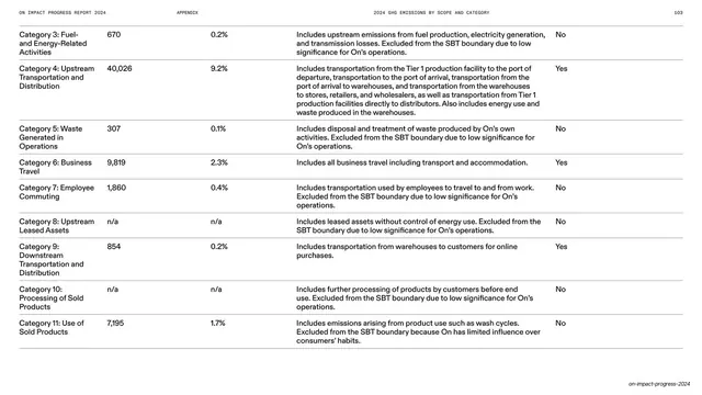
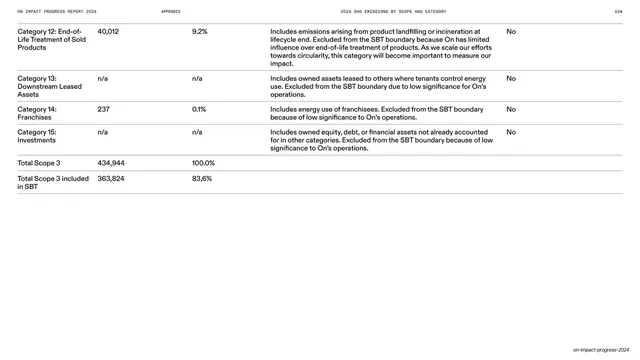
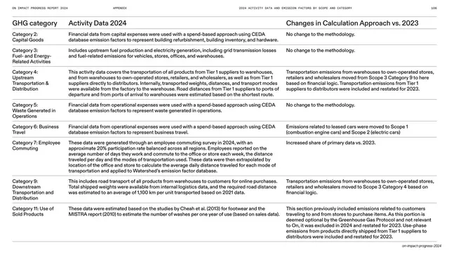
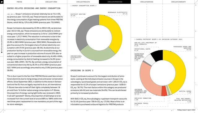
Lime-green data spread pairing a labeled grayscale donut chart of emissions by scope with a right-hand category table of 2024 tonnage and a swatch column.
Summary
A bright lime data spread: a grayscale donut chart of carbon footprint by scope on the left, and a matching category table with tonnage and dot swatches on the right.
Visual description
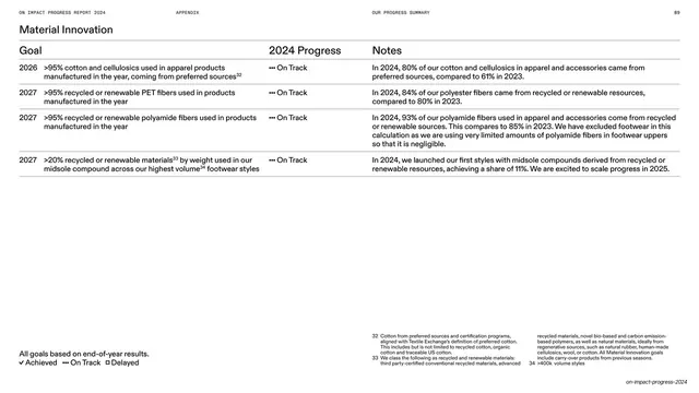
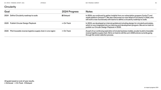
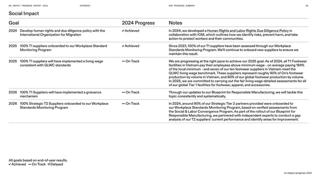
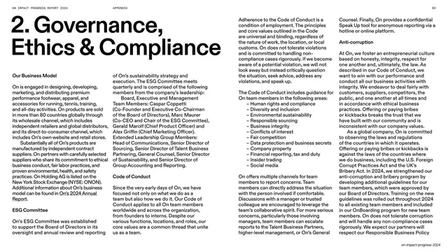
The whole spread sits on a saturated lime-green field. The left page holds a large grayscale donut chart whose wedges are labeled with thin leader lines ("Materials 48.2%," "Transportation 9.4%," and so on), with a small "Not included in SBT boundary" note in the hole, under a two-line dark headline. The right page is a clean table: "Category" and "2024 emissions (tonnes CO2 eq)" headers on a hairline, then rows (Scope 1+2, Scope 3 sub-categories) each ending in a gray-scaled circular swatch keyed to the donut. Small numbered footnotes sit bottom-right. The all-caps running header runs across the top.
Key takeaway
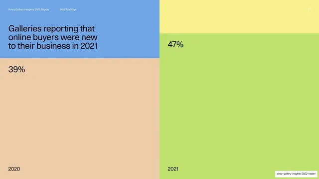
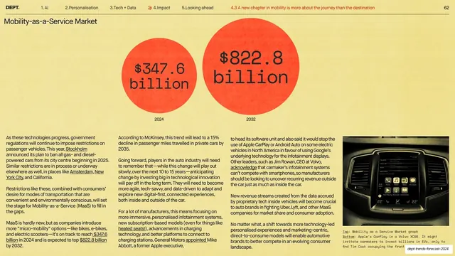
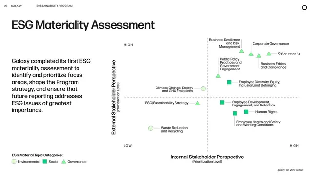
Theming an entire data spread in one brand color while keeping the chart and table strictly grayscale, so the data reads cleanly and the page still feels on-brand. The dot-swatch column that visually links each table row back to its donut wedge is a neat legend-replacement.
Reuse notes
Excellent reference for ESG, finance, or impact-report data pages that must stay legible and unfussy. The grayscale-on-color treatment scales to any brand hue. Reuse the chart-left / table-right split and the swatch-keyed rows for any "by category" breakdown. Keep the palette to one background color plus a gray data ramp to avoid muddiness.
From this deck: Carbon footprint donut chart and category table on lime
View deck


























































More like this





Keep what you find
A free account saves references to boards and can send you a weekly email of picks based on what you save.
To see every result, go Pro.