Preview image. Unlock full-res
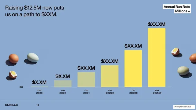
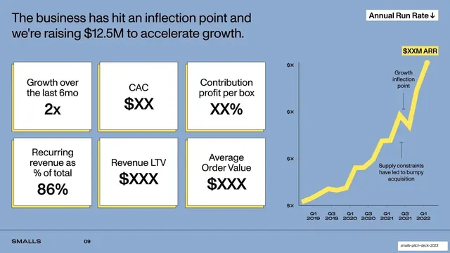
Periwinkle financials slide showing a six-bar annual run rate ramp from 2019 to 2024E that shifts from grey-green history to yellow projection, dressed with cut-out eggs.
Summary
A financials projection slide: a six-bar annual run rate chart ramps from Q4 2019 to Q4 2024E, with the early historic bars in muted grey-green and the later projected bars in bright yellow, framed by cut-out boiled-egg props.
Visual description
Soft periwinkle background. Top-left headline in black: "Raising $12.5M now puts us on a path to $XXM." A white box label top-right reads "Annual Run Rate Millions" with a down arrow. Six vertical bars rise left to right across Q4 2019 through Q4 2024E, each topped with a bold black value placeholder ("$X.XM" growing to "$XX.XM"); the leftmost bars are a muted grey-green (historic) and the bars step into saturated lemon-yellow toward the right (projected), so the color shift marks the transition from actual to forecast. A single thin baseline at $0 anchors the bars. Cut-out photographs of whole and halved boiled eggs sit at the bottom-left and right edges. Footer wordmark and page number at bottom-left.
Key takeaway
Encoding history versus forecast as a color change within one bar series (grey-green for actual, yellow for projected) communicates "this part is real, this part is the plan" without a second chart or legend. The oversized value labels read as the takeaway. The recurring food cut-outs keep even a financials slide warm and on-brand.
Reuse notes
A clean run-rate or revenue-projection template. The actual-versus-projected color split is broadly reusable for any forecast bar chart. Public version uses $XX placeholders; swap in real figures. Keep the baseline minimal and let the bar heights and labels carry the story. Note this slide's printed page number lags the deck order, but the chart is the run-rate ramp described above.
From this deck: Annual run rate projection bar chart
View deck







More like this




Keep what you find
A free account saves references to boards and can send you a weekly email of picks based on what you save.
To see every result, go Pro.