Preview image. Unlock full-res
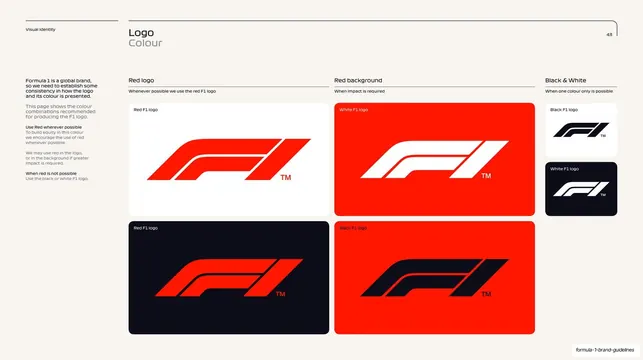
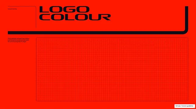
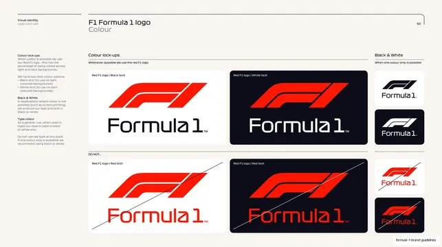
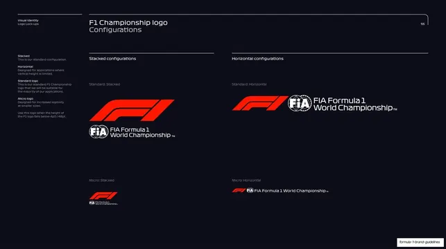
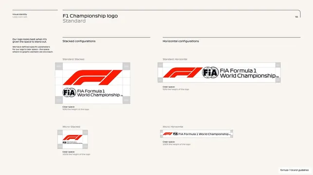
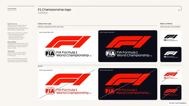
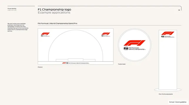
Logo-colour page showing approved F1 mark combinations (red, white, black) as a grid of swatched panels across red, white and dark backgrounds.
Summary
A logo-colour reference page laying out the sanctioned F1 mark and background pairings as a tidy grid of color panels.
Visual description
Warm cream (#F2EEE6) page with the hairline running header and corner-bracket rule, page "43". A left column of body copy explains Formula 1 is a global brand needing consistency, to use red wherever possible, then black or white when red is not. The content area is organized under three small headed columns: "Red logo" (the red mark on a white panel above, and the red mark on a near-black panel below), "Red background" (a white mark and a black mark each on red panels, for when impact is required), and a narrower "Black & White" column at right stacking a black mark on white and a white mark on dark. Each panel is a soft rounded rectangle with a tiny caption naming the variant.
Key takeaway
Turning the approved-combinations rule into a scannable swatch matrix: every legal logo/background pairing shown once as a labeled panel, grouped by intent (default, impact, single-colour). A reader can pick a correct combination in seconds.
Reuse notes
A directly reusable layout for the logo-colour page of any brand guide with a small core palette. The three-bucket grouping (preferred, impact, one-colour) translates to most identities. Needs a disciplined palette; busier color systems will overflow the grid.
From this deck: Logo colour approved combinations
View deck









































More like this




Keep what you find
A free account saves references to boards and can send you a weekly email of picks based on what you save.
To see every result, go Pro.