Preview image. Unlock full-res
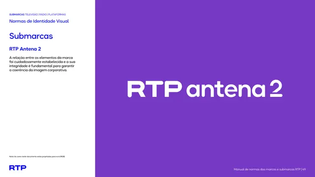
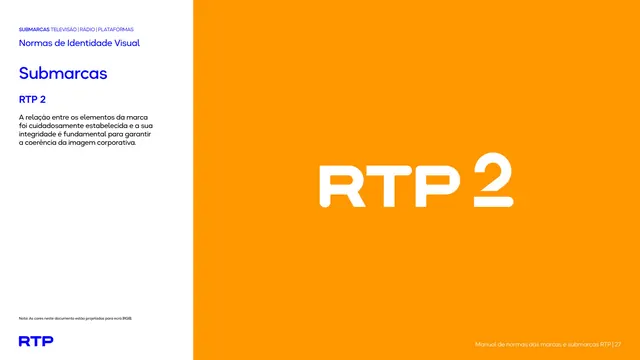
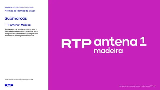
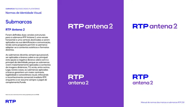
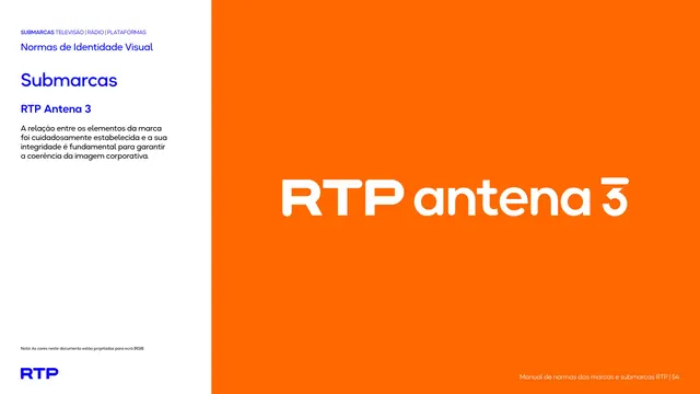
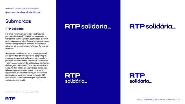
Sub-brand intro page presenting the RTP Antena 2 lockup large in white on a full violet field.
Summary
The introduction page for the RTP Antena 2 sub-brand, showing the lockup large and white on a violet panel.
Visual description
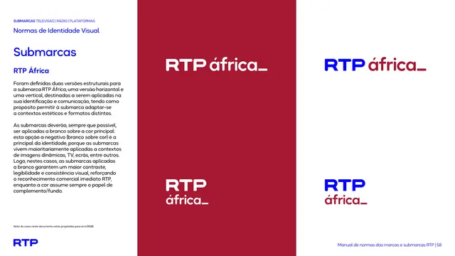
The familiar two-zone layout: white text column left, large violet panel filling the right two-thirds. Text column carries the kicker, "Normas de Identidade Visual", blue "Submarcas" heading, the name "RTP Antena 2", and one short paragraph. On the violet field the lockup reads "RTP antena 2" in white, with bold "RTP", light "antena", and an oversized numeral "2". Blue RTP mark and "Nota" bottom-left, footer bottom-right.
Key takeaway
The single hero lockup on a saturated owned color, with the channel number scaled up as a focal glyph, is a repeatable way to give each station its own page identity while keeping one type system.
Reuse notes
Opening "this is the mark" page for the sub-brand, ahead of the variant page. Relies entirely on the violet field for contrast on the white lockup.
From this deck: RTP Antena 2 lockup intro
View deck













More like this









Keep what you find
A free account saves references to boards and can send you a weekly email of picks based on what you save.
To see every result, go Pro.