Preview image. Unlock full-res
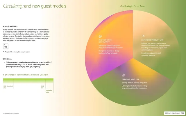
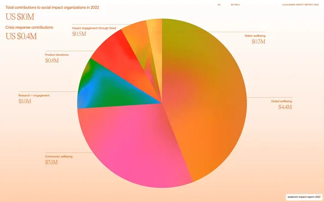
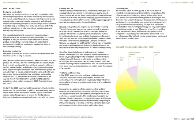
A circularity spread pairing a left text column with a large three-segment gradient pie diagram of strategic focus areas labeled with icons.
Summary
A spread on circularity: a left text column ("WHY IT MATTERS", "OUR GOAL") with a small progress bar, set against a large soft-gradient pie split into three labeled "Strategic Focus Areas" on the right.
Visual description
A light page. The headline "Circularity and new guest models" sits top-left with the first word in serif italic. Below it run a "WHY IT MATTERS" paragraph, a framed UN goal icon, an "OUR GOAL" bullet, and a thin "% OF STORES IN NORTH AMERICA OFFERING LIKE NEW" progress bar. The right two-thirds is dominated by a large circle filled with a smooth orange-to-purple-to-green gradient, divided into three pie wedges; each wedge carries a thin line icon and a label set in pale type: "DESIGNING FOR CIRCULARITY", "EXTENDING PRODUCT LIFE", "CREATING NEXT LIFE", each with two short sub-points. A small "Our Strategic Focus Areas" caption sits above the circle. The slug wordmark sits bottom-right.
Key takeaway
Using a single vibrant gradient-filled circle, segmented into three, as both a diagram and the page's main visual. The gradient gives an otherwise simple three-part framework a premium, almost editorial feel, and line icons keep each wedge scannable.
Reuse notes
A strong way to present a three- or four-part strategy or framework without resorting to plain boxes. The gradient circle is reusable as a recurring "focus areas" device. Keep labels in a high-legibility weight since they sit over a saturated gradient.
From this deck: Circularity and new guest models, gradient pie diagram
View deck












More like this



Keep what you find
A free account saves references to boards and can send you a weekly email of picks based on what you save.
To see every result, go Pro.