Preview image. Unlock full-res
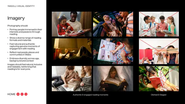
Dark photography page contrasting authentic reading moments against staged cliches, with do and do-not columns and red crosses on the rejects.
Summary
The imagery page: a grid of candid reading photographs labelled authentic, set against a column of staged, cliched shots struck through with red crosses.
Visual description
Black background. Left sidebar carries the "YMGOLLI VISUAL IDENTITY" eyebrow, the "Imagery" title and a bulleted brief: photography should portray people immersed in their interests through reading, show diverse reading formats, feel natural and authentic, reflect real Welsh people and places, and embrace diversity of age and background, closing that images should feel natural, inclusive and relatable. The right area is a photo grid. The left block, captioned "Authentic and engaged reading moments", shows six warm, candid images of varied people reading. A narrower right column, captioned "Cliched and Staged", shows three rejected shots (children hiding behind books, posed close-ups) each overlaid with a large red diagonal cross. "HOME" nav bottom-left.
Key takeaway
Putting approved and rejected photography side by side, with red crosses only on the rejects, teaches art direction faster than words. Naming the cliche to avoid (books-over-faces) is concrete and memorable.
Reuse notes
The standard photography do/do-not page; reuse the good-grid-versus-crossed-rejects layout for any brand with a documentary photo style. Strong for campaigns that must read as inclusive and real rather than stock.
From this deck: Imagery
View deck



More like this




Keep what you find
A free account saves references to boards and can send you a weekly email of picks based on what you save.
To see every result, go Pro.