Preview image. Unlock full-res
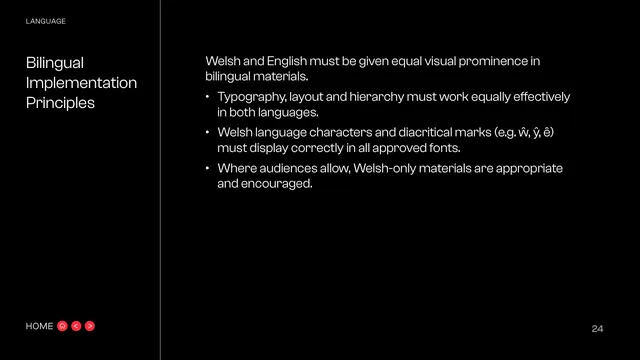
Black body page with three principles for equal-prominence bilingual layout, including correct Welsh diacritics in approved fonts.
Summary
The bilingual implementation page: three practical principles ensuring Welsh and English get equal visual prominence, including correct display of Welsh diacritical marks.
Visual description
Black background, white text, standard chassis. Eyebrow "LANGUAGE" over the three-line title "Bilingual Implementation Principles", hairline rule alongside. The right column opens "Welsh and English must be given equal visual prominence in bilingual materials." followed by three bullets: typography, layout and hierarchy must work equally effectively in both languages; Welsh language characters and diacritical marks (shown as examples w-circumflex, y-circumflex, e-circumflex) must display correctly in all approved fonts; and where audiences allow, Welsh-only materials are appropriate and encouraged. Empty space below. "HOME" nav bottom-left, page "24" bottom-right.
Key takeaway
Calling out diacritic support with actual example glyphs is a precise, often-missed requirement, it makes the font-choice consequential. Permitting Welsh-only materials signals genuine commitment, not token bilingualism.
Reuse notes
Reuse for any identity that has to operate in a language with accented characters; the "diacritics must render in approved fonts" rule is a concrete font-selection constraint. Pairs directly with the preceding tone-of-voice policy page.
From this deck: Bilingual Implementation Principles
View deck








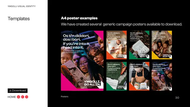
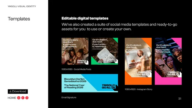
More like this

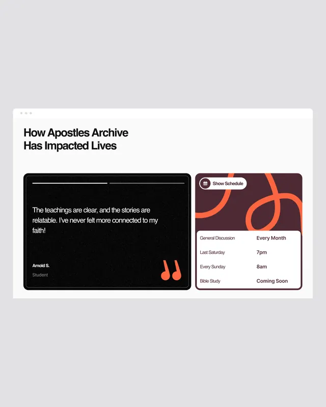
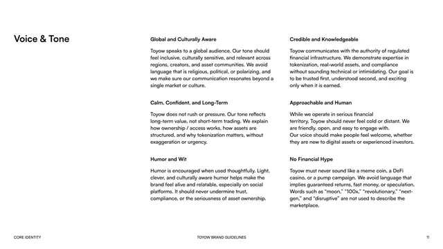


Keep what you find
A free account saves references to boards and can send you a weekly email of picks based on what you save.
To see every result, go Pro.