Preview image. Unlock full-res
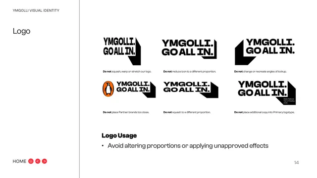
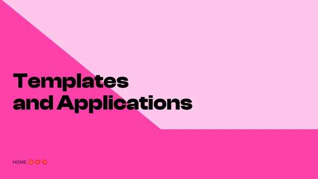
White page showing six incorrect logo treatments in a grid, each captioned Do not, with a usage rule against altering proportions.
Summary
The logo misuse page: a 3-by-2 grid of six incorrect lockup treatments, each labelled "Do not", reinforcing one rule against altering proportions or effects.
Visual description
White background, "YMGOLLI VISUAL IDENTITY" eyebrow and "Logo" title in the left sidebar. The main area is a 3-column, 2-row grid of black "YMGOLLI. GO ALL IN." lockups shown wrong, each with a small caption beneath: do not squash, warp or stretch; do not reduce the icon to a different proportion; do not change or recreate the angles of the lockup; do not place partner brands too close (shown with a Penguin oval crowding the mark); do not squash to a different proportion; do not place additional copy into the primary logotype (shown with "Wales National Year of Reading 2026" jammed in). A "Logo Usage" subhead below carries one bullet: avoid altering proportions or applying unapproved effects. "HOME" nav bottom-left, page "14" bottom-right.
Key takeaway
A tight grid of captioned wrong-examples is the clearest way to police a logo; pairing each with a specific "Do not" verb leaves no ambiguity. Reusing real failure cases (partner crowding, copy injection) ties back to earlier rules.
Reuse notes
The standard misuse page; six is a good count, enough to cover the common abuses without padding. Reuse the verb-led caption format and keep examples to genuine, likely mistakes for the brand.
From this deck: Logo misuse, do nots
View deck
More like this




Keep what you find
A free account saves references to boards and can send you a weekly email of picks based on what you save.
To see every result, go Pro.